Learn to Love Your Existing Content – 5 Ways to Get More Visibility
Posted by JamesAgate
[Estimated read time: 9 minutes]
For the most part, articles on content promotion focus on launching new content.
Today I want to focus on getting the most out of (and in some cases, breathing new life into) existing content.
We frequently see clients that have a variety of content assets already. Where possible, I always advocate using what’s on hand over indiscriminately pumping out new content.
For the following exercise, we need to start by identifying the content assets; we’ll be looking for unloved and underloved assets.
- Unloved = content that exists but nobody has even noticed it. It has very few links, social shares, and little to no traffic.
- Underloved = content that exists, was launched, and did okay, but never reached its full potential. (I can count on one hand the number of times we’ve found a piece that we couldn’t squeeze at least one campaign out of.)
It’s important to note that, in many cases, we’ve been alerted to content that’s unloved because it’s essentially invisible but potentially very valuable. One good example of this would be an internal knowledge base that your sales team maintains.
Identifying pages with potential
Often it’s easier to spot underloved content than it is to find completely unloved content.
Our preferred method is to plug a domain into Ahrefs.com Site Explorer, navigate to the “Top Pages” tab (which in their redesign now seems to be called “Best By Links”), and start working your way through the URLs that you find.

You can also use Ahrefs.com “Best By Shares” feature, which will present all pages in order of their social share count. Again, this can be useful in terms of pointing you towards assets that may perform well with some additional promotion.
I tend to pull together all the URLs that I find so that I can work on them/review in conjunction with other sources.
The other sources being, in this case:
- The client (or perhaps colleagues at your company) alerting you to “invisible” content
- Google Analytics to identify pages that perhaps get some traffic but have no links or social shares
- Sitemap or crawl of your domain
You should now have a file of all of your existing content assets. You’re ready to match these up against any content opportunities in your market that you’ve previously identified, or as a result of evaluating the assets you’ve found and researching the possible opportunities.
This might include things like:
- Keywords – You’ve identified keywords around certain topic areas that are worth targeting.
- Broken link opportunities – Perhaps you’ve identified specific broken resources that you’re looking to target. (Shameless plug: our broken link prospecting tool should be launching later this month.)
- Rich veins of link opportunities – Perhaps you’ve spotted a niche within your market that’s particularly attractive from a linking standpoint.
Now you can assess whether the content you have fits that opportunity. It probably won’t be a perfect match, but is it close enough to not warrant creating a whole new piece of content?
If a new piece of content is truly needed, set that opportunity aside in favor of the others for the moment. Remember, right now we’re just focusing on priming and promoting existing content.
Priming existing content
I did say we weren’t going to be creating new content, but there is some work involved. Unless you get really lucky, the content assets you discover will probably need a little TLC before they’re ready to be promoted.
Repurpose/Reformat
So… I lied. This does involve creating a new piece of content. But, in my defense, you’re taking the meat from an existing asset and creating something that matches the opportunity you’re looking to target.
In essence, you’ll be extracting ideas from a content asset to produce something that’s worthy of promotion. A good example of this might be taking the key ideas from a webinar and turning that into a cheatsheet; this can be promoted as a resource far more easily than a full-on webinar.
Consolidate
This is, by far, the most common scenario. Clients will come to us from other providers who’ve said that 4 blog posts per month is going to change their business. In isolation, most of these blog posts aren’t worth promoting. When consolidated, however, they can become something more substantial.
Improve
This involves enhancing a piece of content that’s nearly there but is perhaps missing a section or two, or could be updated with the latest industry best practices.
Optimize
This could be improving the formatting of a piece to make it more digestible or — perhaps more crucially — adjusting the page to target specific keywords. For example, we’ve just finished working with a client to update and better optimize their existing blog posts for specific keywords that attract huge search volumes in their market. In one case, this meant a solid blog post that was completely unloved now ranks in the top three results for a term that gets searched around 10,000 times per month. These aren’t commercial keywords, but rather informational queries that have the potential to lead people into the client’s commercial landing pages.
Promoting existing content
#1: Reach out to people who’ve shared similar content
A good place to start when promoting content is some proactive outreach. What better place to start than with people who’ve already linked to similar/related content?
This can be quite a manual process: searching various keywords relating to the content, identifying websites that have said content, plugging each URL into Ahrefs, Majestic, or Open Site Explorer to see who links, sifting through to see who’s worth contacting, and then performing the actual outreach.
To this end, we built our (free) Similar Content Prospecting Tool to take the heavy lifting out of this process. You enter the keywords and it finds the content that ranks highest for them, gathers those that link to that content, sifts through and removes the lower-end stuff, and presents the top links for you to review and export, ready for contact.
You can find people who link to similar content or, with the right keywords, you can find people who link to related content. Both groups of prospects may be interested in linking to you.
For example, say you have a piece of content that looks at keeping children safe on their smartphone. You might want to identify those that link to top-ranking content on “Internet safety,” as there’s likely to be crossover. Those prospects will potentially be interested in your content because it fills a gap that currently exists on their site.
For further reading, see: You Can Get Links from Cold Outreach.
#2: Look for broken link opportunities
I know I’ve plugged it once before, but we’re launching Linkrot.com later this month (all being well) and this will automate the process of finding broken link opportunities. For now, prospecting for opportunities can be a largely manual process (take a look at the additional resources linked to below to get a feel for the process). This can be eased with extensions like LinkMiner from Jon Cooper at PointBlankSEO. And of course there are prospecting tools on the market currently that can help with the search, such as BrokenLinkBuilding.com.
Broken link building is extremely powerful and, in my opinion, still under-utilized. For the uninitiated, at its most basic level it involves a) finding pages that used to exist but are now dead and that people have linked to, b) tailoring your content asset to fit that opportunity, and c) reaching out to those that link, to suggest they update their link to your page.
Take a look at this chart:

Source: Do Short Outreach Emails Get You More Links?
As you can see, the publish rate (percentage of people who link versus number who were contacted) is considerably higher than with other reasons for outreach.
As a side note, before you go ignoring the other techniques: the pool of opportunities is significantly smaller for broken link building. So, whilst you might convert more prospects into links, there will be fewer prospects to start with.
One of the quickest ways to find broken links manually is to search for resource pages in your industry and scan them for dead pages.
For further reading, see: Broken Link Building Bible, Creative Broken Link Building Strategies, 53 Broken Link Resources.
#3: Devise a new angle
This applies in particular to underloved content assets. Adjusting the niche you pitch can have a significant impact on publish rate.
This may involve more than just adjusting your prospecting efforts and your email template. It’s likely to involve tweaking your piece of content to better fit who you’re planning to target.
A straightforward example would be targeting a different country. Perhaps you’ve had success reaching out to schools in the US. With some adjustments to the piece and to your approach, you might be able to find schools in the UK or Canada that might also find your content useful and link-worthy.
#4: Consider paid promotion
In the past, I’ve recommended offerings like Outbrain and Taboola. In the early days of both of these platforms we actually saw a really good return, but I’m not ashamed to say that we can’t make them work anymore.
I think this are many reasons for this. Consumers are becoming increasingly blind to these “around the web” links; there seems to be limited quality control in terms of advertisers or adverts so they have become increasingly spammy-looking (which harms clickthrough rates); and finally, due to the surge in popularity, the traffic isn’t all that cheap anymore.

One platform that I think is underrated is StumbleUpon Paid Discovery; we find it useful for amplifying content alongside proactive outreach.
I do also like Facebook advertising as a way of reaching very specific audiences. However, we typically only utilize paid media like this where the goals of a campaign go beyond link building because it’s REALLY hard to draw that direct line between your Facebook ad spend and number of referring domains.
#5: Connect your content to a wider story
Yes, I know people say that press releases are dead. Certainly, as a form of link building or the sole method of generating press, they just might be. But for announcing content, they can still be very effective.
We’ve found if you can tap into a developing story and go hyper-focused, then you can A) generate some coverage of your content and B) leverage that coverage for further coverage with some proactive outreach.
You might think this sounds like a technique for a new piece of content, but that’s not so. We’ve recently found this approach useful in campaigns where prospects are indifferent to our standard outreach approach. They feel that the issue we’re talking about either doesn’t matter or doesn’t apply to them. A well-written press release can change all of that.
You’re flipping the issue on its head, making it about the broader story rather than simply a piece of your content. A punchy title, some official stats and a nice quote from the CEO can help generate some initial coverage. You can then take that initial coverage and use it as social proof in your proactive outreach.
Any questions or ways that you squeeze more juice out of your existing content? I’d welcome them in the comments section below.
Sign up for The Moz Top 10, a semimonthly mailer updating you on the top ten hottest pieces of SEO news, tips, and rad links uncovered by the Moz team. Think of it as your exclusive digest of stuff you don’t have time to hunt down but want to read!
Google launches rich cards for movies and recipe websites
Google upgrades rich snippets, adding a rich cards for movies and recipes web sites. They also added a new section in the Google Search Console for reporting.
The post Google launches rich cards for movies and recipe websites appeared first on Search…
Introducing rich cards
Rich cards are a new Search result format building on the success of rich snippets. Just like rich snippets, rich cards use schema.org structured markup to display content in an even more engaging and visual format, with a focus on providing a better mobile user experience.

Evolution of search results for queries like [peanut butter cookies recipe]: with rich cards, results are presented in carousels that are easy to browse by scrolling left and right. Carousels can contain cards all from the same site or from multiple sites.
For site owners, this is a new opportunity to stand out in Search results and attract more targeted users to your page. For example, if you have a recipe site, you can build a richer preview of your content with a prominent image for each dish. This visual format helps users find what they want right away, so you’re getting users who specifically want that especially delicious cookie recipe you have.
We’re starting to show rich cards for two content categories: recipes and movies. They will appear initially on mobile search results in English for google.com. We’re actively experimenting with more opportunities to provide more publishers with a rich preview of their content.
We’ve built a comprehensive set of tools and completely updated our developer documentation to take site owners and developers from initial exploration through implementation to performance monitoring.
Explore rich card types and identify where your content fits
Browse the new gallery with screenshots and code samples of each markup type.
Test and tweak your markup
We strongly recommend using JSON-LD in your implementation.
- Find out which fields are essential to mark up in order for a rich card to appear. We’ve also listed additional fields that can enhance your rich cards.
- See a preview in revamped Structured Data Testing Tool of how the rich card might appear in Search (currently available for recipes and movies).
- Use the the Structured Data Testing Tool to see errors as you tweak your markup in real time.
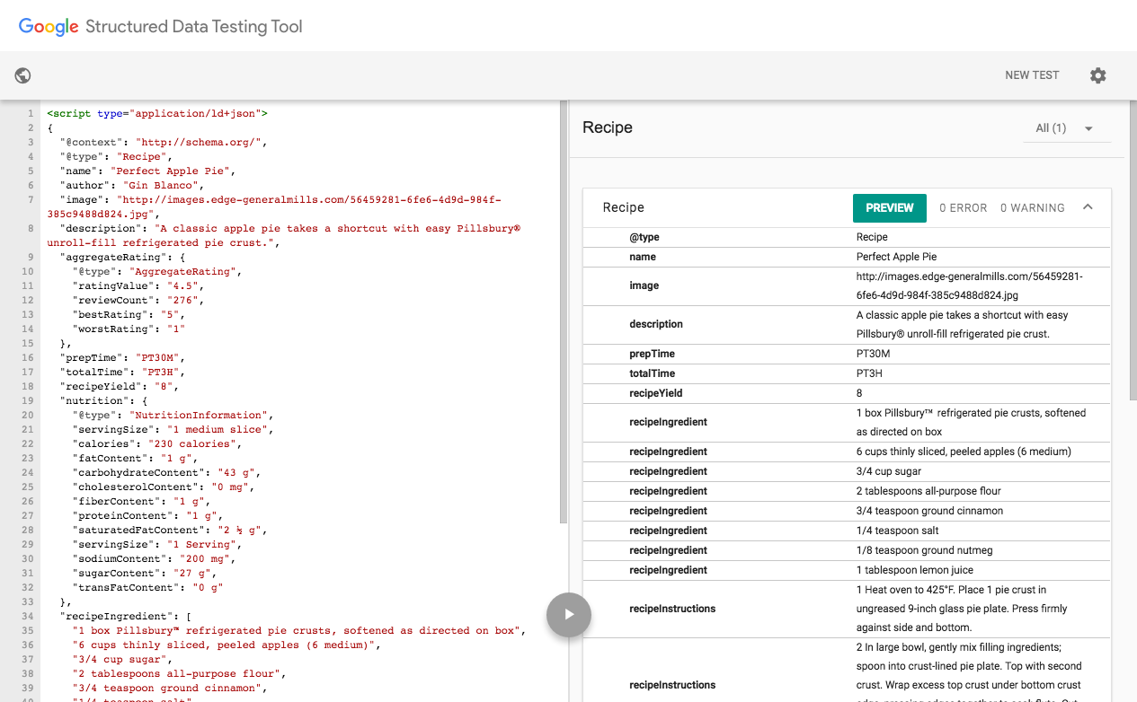
Keep track of coverage and debug errors
Check how many of your rich cards are indexed in the new Search Console Rich Cards report.
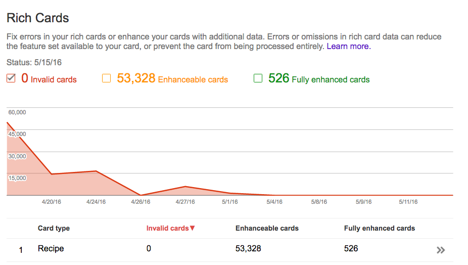
- Keep an eye out for errors (also listed in the Rich Cards report). Each error example links directly to the Structured Data Testing tool so you can test it.
- Submit a sitemap to help us discover all your marked-up content.
Find opportunities for growth
In the Rich Cards report, you’ll see which cards can be enhanced by marking up additional fields.

Monitor performance
A new “Rich results” filter in Search Analytics (currently in a closed beta) will help you track how your rich cards and rich snippets are doing in search: you’ll be able to drill down and see clicks and impressions for both.
Q: Can I keep my existing rich snippets markup?
A: Yes, you can! We’ll keep you posted as the rich result ecosystem evolves.
Q: What about the Structured Data report in Search Console?
A: The Structured Data report will continue to show only top-level entities for the existing rich snippets (Product, Recipe, Review, Event, SoftwareApplication, Video, News article) and for any new categories (e.g., Movies). We plan to migrate all errors from the structured data report into rich card report.
Q: What if I use the wrong markup?
A: Technical and quality guidelines apply for rich cards as they do for rich snippets. We will enforce them as before.
Learn more about rich cards in the Search and the mobile content ecosystem session at Google I/O (which will be live streamed!) or on the Developer site. If you have more questions, find us in the dedicated Structured data section of our forum, on Twitter or on Google+.
Posted by Na’ama Zohary, Search Console Team, and Elliott Ng, Product Management Director, Search Ecosystem


SearchCap: Google mobile friendly tool, Bing Ads editor & more
Below is what happened in search today, as reported on Search Engine Land and from other places across the web.
The post SearchCap: Google mobile friendly tool, Bing Ads editor & more appeared first on Search Engine Land.
Please visit Search Engine Land for the full article.
9 reasons you should attend SocialPro in Seattle this June
Are you a professional social media marketer focused on driving results for your company or clients? Then SocialPro is the conference for you. SocialPro is designed from the ground up by the Marketing Land team to focus on the real-world challenges you…
URLs and Photos No Longer Count Towards the Character Limit on Twitter
A few months ago, Twitter was talking about pushing its character limit out to 10,000+. There was a huge debate over how essential the character limit is to the essence of Twitter.
read more
Google AdWords Timezone Support For Conversion Imports
Google quietly announced on Google+ that you can now set your timezones for your AdWords conversion imports. Google wrote that you can “set time zones for your conversion imports with time zone IDs.”
The time zone IDs are listed over here…
Official: Google Image Search Gets Shopping Ads
It is official, after months of testing ads on Google Images, now Google announced image search will have Google Shopping Ads.
Google said they are “introducing Shopping ads on image search…
Check Out Google’s New Mobile Friendly Testing Tool
After it leaking that Google was testing a new mobile friendly testing tool a couple weeks ago, today, Google officially announced the new tool that can be found here.
The new tool is slicker, less frightening…
Google Search Console Checks For Apple Universal Links For App Association
As you know, Google Search Console will let you track your app’s analytics and crawl stats for Android apps. It also lets iOS app developers submit their iOS apps so they can do the app association to their web site…
Here’s an AdWords script to check for empty ad groups
See if you’ve left any ad groups empty with a new script from columnist Daniel Gilbert of Brainlabs.
The post Here’s an AdWords script to check for empty ad groups appeared first on Search Engine Land.
Please visit Search Engine Land for the full article.
How one small word makes a huge difference on Google SERPs
Recently we’ve had a lot of internal discussions about the importance of keywords and the various combinations, including match type.
robots.txt: the ultimate guide
The robots.txt file is one of the primary ways of telling a search engine where it can and can’t go on your website. All major search engines support the basic functionality it offers. There are some extra rules that are used by a few search engines which can be useful too. This guide covers all […]
Google’s Gary Illyes On Crawl Budget, Scheduling & Host Load
During the Stone Temple Consulting Q&A with Gary Illyes on YouTube the other week, he spoke about crawl budget and how Google doesn’t necessarily crawl based on crawl budget. He said internally…
Search intent signals: aligning organic & paid search strategy
Columnist Jim Yu explains how understanding searcher intent in regard to the buyer journey can help paid and online search marketers work together more effectively.
The post Search intent signals: aligning organic & paid search strategy appeared f…
Google launches their new mobile-friendly testing tool
Google revamped the mobile-friendly testing tool after its launch back in November 2014.
The post Google launches their new mobile-friendly testing tool appeared first on Search Engine Land.
Please visit Search Engine Land for the full article.
Bing Ads Editor 11.0 debuts with multiple account management, better search, easier login
The new version takes its cues from AdWords Editor, but it has a few notable differences.
The post Bing Ads Editor 11.0 debuts with multiple account management, better search, easier login appeared first on Search Engine Land.
Please visit Search En…
How do I make sure my site is mobile friendly? A checklist
Last week, Google’s Webmaster Trends Analyst John Mueller confirmed on Twitter that the latest wave of changes to Google’s mobile-friendly ranking signal has now finished rolling out.
BBC Food website closure: what have we lost and who stands to benefit?
Today it was announced that the BBC Food recipe website is to close, or at least mothballed in some way. It contains … read more
Sweating the Details – Rethinking Google Keyword Tool Volume
Posted by rjonesx.
[Estimated read time: 13 minutes]
I joined Moz in August of 2015 and fell right into the middle of something great. Rand had brought his broad vision of a refined yet comprehensive SEO keyword tool to a talented team of developers, designers, data scientists and project managers… and now, me.
I was hoping to ease in with a project that was right up my wheelhouse, so when the “Volume” metric in Keyword Explorer was pitched as something I could work on, I jumped right on it. In my mind, I was done the second the work was offered to me. I already had a giant keyword volume database at my disposal and a crawling platform ready to fire up. All I had to do was tie some strings together and, voilà.
Peer pressure
It was subtle at first, and never direct, but I quickly began to see something different about the way Moz looked at problems. I’ve always been a bit of a lazy pragmatist — when I need a hammer, I look around for something hard. It’s a useful skill set for quick approximations, but when you have months set aside to do something right, it’s a bit of a liability instead.
Moz wasn’t looking for something to use instead of a hammer; they were looking for the perfect hammer. They were scrutinizing metrics, buttons, work flows… I remember one particularly surreal discussion around mapping keyboard shortcuts within the web app to mimic those in Excel. So, when on my first attempt I turned up in a planning meeting with what was, essentially, a clone of Google Keyword Planner volume, I should have seen it coming. They were polite, but I could feel it — this wasn’t better, and Moz demanded better in their tools. Sometimes peer pressure is a good thing.
If it ain’t broke, don’t fix it.
Rand was, unsurprisingly, the first to question whether or not volume data was accurate. My response had always been that of the lazy pragmatist: “It’s the best we got.” Others then chimed in with equally valid questions — how would users group by this data? How much do we have? Why give customers something they can already get for free?
Tail tucked between my knees, I decided it was time to sweat the details, starting with the question: “What’s broke?” This was the impetus behind the research which lead to this post on Keyword Planner’s dirty secrets, outlining the numerous problems with Google Keyword Planner data. I’ll spare you the details here, but if you want some context behind why Rand was right and why we did need to throw a wrench into the conventional thinking on keyword volume metrics, take a look at that post.
Here was just one of the concerns — that Google Adwords search volume puts keywords into volume buckets without telling you the ranges.

Well, it’s broke. Time to sweat the details!
Once it became clear to me that I couldn’t just regurgitate Google’s numbers anymore and pretend they were the canonical truth of the matter, it was time to start asking the fundamental questions we want answered through a volume metric. In deliberation with the many folks working on Keyword Explorer, we uncovered four distinct characteristics of a good volume metric.
- Specificity: The core of a good volume metric is being specific to the actual average search volume. You want the volume number to be as close as possible to reality.

- Coverage: Volume varies from month to month, so not only do you want it to be specific to the average across all months, you want it to be specific to each individual month. A good volume metric will give you reasonable expectations every month of the year — not just the whole year divided by 12.

- Fresh: A good volume metric will take into account trends and adjust to statistically significant variations which diverge from the previous 12 months.

- Relatable: A good volume metric should allow you to relate keywords to one another when they are similar in volume (i.e.: grouping).
We can actually apply these four points to Google Keyword Planner and see its weaknesses…
- Specificity: Google’s Keyword Volume is a yearly rounded, bucketed average of monthly rounded, bucketed averages
- Coverage: For most keywords, the average monthly search is accurate only 33% of the months of the year. Most months, the actual volume will land in a different volume bucket than the average monthly search.
- Fresh: Keyword Planner updates once a month, with averages not providing predictive value. A hot new keyword will look 1/12th its actual volume in the average monthly search, and it won’t show up for 30 days.
- Relatable: You can group keywords in 1 of the 84 different volume buckets, with no explanation as to how the groups were formed. (They appear to be associated with a simple logarithmic curve.)
You can see why we were concerned. The numbers aren’t that specific, have ranges that are literally wrong most of the time, are updated regularly but infrequently, and aren’t very group-able. Well, we had our work cut out for us, so we began in earnest attacking the problems…
Balancing specificity and coverage
As you can imagine, there’s a direct trade-off between specificity and coverage. The tighter the volume ranges, the higher the specificity and lower the coverage. The broader the ranges, the lower the specificity and higher coverage. If we only had one range that was from zero to a billion, we would have horrible specificity and perfect coverage. If we had millions of ranges, we would have perfect specificity but no coverage. Given our weightings and parameters, we identified the best possible arrangement. I’m pretty sure there’s a mathematical expression of this problem that would have done a quicker job here, but I am not a clever man, so I used my favorite tool of all: brute force. The idea was simple.
- We take the maximum and minimum boundaries of the search volume data provided by Google Keyword Planner, lets say… between 0 and 1 billion.
- We then randomly divide it into ranges — testing a reasonable number of ranges (somewhere between 10 and 25). Imagine randomly placing dividers between books on a shelf. We did that, except the books were keyword volume numbers.
- We assign a weighting to the importance of specificity (the distance between the average of the range min and max from the keyword’s actual average monthly search). For example, we might say that it’s 80% important that we’re close to the average for the year.
- We assign a weighting to the importance of coverage (the likelihood that any given month over the last year falls within the range). For example, we might say it’s 20% important that we’re close to the average each month.
- We test 100,000 randomly selected keywords and their Google Keyword Planner volume against the randomly selected ranges.
- We use the actual average of the last 12 months rather than the rounded average of the last 12 months.
- We do this for millions of randomly selected ranges.
- We select the winner from among the top performers.
It took a few days to run (the longer we ran it, the rarer new winners were discovered). Ultimately, we settled on 20 different ranges (a nice, whole number for grouping and displaying purposes) that more than doubled the coverage rate over the preexisting Google Keyword Planner data while minimizing damage to specificity as much as possible. Let me give an example of how this could be useful. Let’s take the keyword “baseball.” It’s fairly seasonal, although it has a long season.

In the above example, the Google Average Monthly Search for Baseball is 368,000. The range this covers is between around 330K and 410K. As you can see, this range only covers 3 of the 12 months. The Moz range covers 10 of the 12 months.
Now, imagine that you’re a retailer that’s planning PPC and SEO marketing for the next year. You make your predictions based on the 368,000 number given to you by Google Keyword Planner. You’ll actually under-perform the average 8 months out of the year. That’s a hard pill to swallow. But, with the Moz range, you can use the lower boundary as a “worst-case scenario.” With the Moz range, your traffic under-performs only 2 months out of the year. Why pretend that we can get the exact average when we know the exact average is nearly always wrong?
Improving relatability
This followed naturally from our balancing specificity and coverage. We did end up choosing 20 groupings over some higher-performing groupings that were less clean numbers (like 21 groupings) for aesthetic and usability purposes. But what this means is that it’s easy to group keywords by volume and not in an arbitrary fashion. You could always group by ranges in Excel, if you wanted, but the ranges you came up with off the top of your head wouldn’t have been validated in any way regarding the underlying data.
Let me give an example why this matters. Intuitively, you’d imagine that the ranges would increase in broadness in a similar logarithmic fashion as they get larger. For example, you might think most keywords are 10% volatile, so if a keyword is searched 100 times a month, you might expect some months to be 90 and others 110. Similarly, you would expect a keyword searched 1,000 times a month to vary 10% up or down as well. Thus, you would create ranges like 0–10, 100–200, 1,000–2,000, etc. In fact, this appears to be exactly what Google does. It’s simple and elegant. But is it correct?
Nope. It turns out that keyword data is not congruent. It generally follows these patterns, but not always. For example, in our analysis, we found that while the volume range after 101–200 is 201–500 (a 3x increase in broadness), the very next optimal range is actually 501–850, only a 1/6th increase in broadness.
This is likely due to non-random human search patterns related to certain keywords. There are keywords which people probably search daily, weekly, monthly, quarterly, etc. Imagine keywords like “what is the first Monday of this month” and “what is the last Tuesday of this month.” All of these keywords would be searched a similar number of times by a similar population a similar number of times each month, creating a congruency that is non-random. These patterns create shifts in the volatility of terms that are not congruent with a natural logarithmic scale you would expect if the data was truly random. Our machine-learned volume ranges capture this non-random human behavior efficiently and effectively.
We can actually demonstrate this quite easily in a graph.

Notice in this graph that the log of Google’s Keyword Planner volume ranges are nearly linear, except at the tail ends. This would indicate that Google has done very little to try and address patterns in search behavior that make the data non-random. Instead, they apply a simple logarithmic curve to their volume buckets and leave it at that. The R2 value shows just how close to 1 (perfect linearity) this relationship is.

The log of Moz’s keyword volume ranges are far less linear, which indicates that our range-optimization methodologies found anomalies in the search data which do not conform to a perfect logarithmic relationship with search volume volatility. These anomalies are most likely caused by real non-random patterns in human search behavior. Look at positions 11 and 12 in the Moz graph. Our ranges actually contract in breadth at position 12 and then jump back up at 13. There is a real, data-determined anomaly which shows the searches in that range actually have less volatility than the searches in the previous range, despite being searched more often.
Improving freshness
Finally, we improved freshness by using a completely new, thirrd-party anonymized clickstream data set. Yes, we analyze 1-hour delayed clickstream data to capture new keywords worth including both in our volume data and our corpus. Of course, this was a whole feat in and of itself; we have to parse and clean hundreds of millions of events daily into usable data. Furthermore, a lot of statistically significant shifts in search volume are actually ephemeral. Google Doodles are notorious for this, causing huge surges in traffic for obscure keywords just for a single day. We subsequently built models to look for keywords that trended upward over a series of days, beyond the expected value. We then used predictive models to map that clickstream search volume to a bottom quartile range (i.e.: we were intentionally conservative in our estimates until we could validate against next month’s Google Keyword Planner data).
Finally, we had to remove inherent biases from the clickstream dataset itself so that we were confident our fresh data was reliable. We accomplished this by…
- Creating a naive model that predicts Google Keyword Volume from the clickstream data
- Tokenizing the clickstream keywords and discovering words and phrases that correlate with outliers
- Building a depressing and enhancing map of these tokens to modify the predictive model based on their inclusion
- Applied the map to the naive model to give us better predictions.
This was a very successful endeavor in that we can take raw clickstream data and, given certain preconditions (4 weeks of steady data), we can predict with 95% accuracy the appropriate volume range.
A single metric
All of this above — the research into why Google Keyword Planner is inadequate, the machine-learned ranges, the daily freshness volume updating, etc. — all goes into a single, seemingly simple, metric: Volume Ranges. This is probably the least-scrutinized of our metrics because it’s the most straightforward. Keyword Difficulty, Keyword Opportunity, and Keyword Potential went through far more revisions and are far more sophisticated in their approach, analysis, and production.
But we aren’t done. We’re actively looking at improving the volume metric by adding more and better data sources, predicting future traffic, and potentially providing a mean along with the ranges. We appreciate any feedback you might offer, as well, on what the use cases might be for different styles of volume metrics
However, at the end of the day, I hope what you come away with is this: At Moz, we sweat the details so you don’t have to.
A personal note
This is my first big launch at Moz. While I dearly miss my friends and colleagues at Angular (the consulting firm for whom I worked for the past 10 years), I can’t say enough about the amazing people I work with here. Most of them will never blog here, won’t tweet, and won’t speak at conferences. But they deserve all the credit. So, here’s a picture of my view from Google Hangouts from a Keyword Explorer meeting. Most of the team was able to make it, but those who didn’t, you know who you are. Thanks for sweating the details.

Sign up for The Moz Top 10, a semimonthly mailer updating you on the top ten hottest pieces of SEO news, tips, and rad links uncovered by the Moz team. Think of it as your exclusive digest of stuff you don’t have time to hunt down but want to read!