An update on Google’s feature-phone crawling & indexing
Limited mobile devices, “feature-phones”, require a special form of markup or a transcoder for web content. Most websites don’t provide feature-phone-compatible content in WAP/WML any more. Given these developments, we’ve made changes in how we crawl f…
Building Indexable Progressive Web Apps
Progressive Web Apps (PWAs) are taking advantage of new technologies to bring the best of mobile sites and native applications to users — and they’re one of the most exciting new ideas on the web. But to truly have an impact, it’s important that they’re indexable and linkable. Every recommendation presented in this article is an existing best practice for indexability — regardless of whether you’re building a Progressive Web App or a simple static website. Nonetheless, we have collated these best practices to provide a checklist to guide you:
Make Your Content Crawlable
Why? Historically, websites would always generate or render their HTML on the server which is the simplest way to ensure your content is directly linkable. Web applications popularised the concept of client-side rendering in which content is updated dynamically on the page as the users navigates without requiring the page to be reloaded.
The modern approach is hybrid rendering, in which server-side rendering is used when a user navigates directly to a URL and client-side rendering is used after the initial page load for subsequent navigation and asynchronous requests.
Our server-side PWA sample demonstrates pure server-side rendering, while our hybrid PWA sample demonstrates the combined approach.
If you are unfamiliar with the server-side and client-side rendering terminology, check out these articles on the web read here and here.
<!– yeah, maybe not http://2.bp.blogspot.com/-41v6n3Vaf5s/UeRN_XJ0keI/AAAAAAAAN2Y/YxIHhddGiaw/s1600/css.gif .boxbox { float:left; min-width: 31%; max-width: 300px; word-wrap:break-word; padding: 0.2em;} .badbox { background-color: #eba; } .goodbox { background-color: #ded; } .avoidbox { background-color: #ffd; } .boxbox h5 { font-size: 1em; font-weight: bold; margin: 0.5em 0;} br.endboxen { clear: both; } –><!–
Best Practice:
box
Avoid:
box
Don’t:
box
–>
Best Practice:
Use server-side or hybrid rendering so users receive the content in the initial payload of their web request.
Always ensure your URLs are independently accessible:
https://www.example.com/product/25/
The above should deep link to that particular resource.
If you can’t support server-side or hybrid rendering for your Progressive Web App and you decide to use client-side rendering, we recommend using the Google Search Console “Fetch as Google tool” to verify your content successfully renders for our search crawler.
Don’t:
Don’t redirect users accessing deep links back to your web app’s homepage.
Additionally, serving an error page to users instead of deep linking should also be avoided.
Provide Clean URLs
Why? Fragment identifiers (#user/24601/ or #!user/24601/) were an effective workaround for browsers to AJAX new content from a server without reloading the page. This design is known as client-side rendering.
However, the fragment identifier syntax isn’t compatible with some web tools, frameworks and protocols such as Facebook’s Open Graph protocol.
The History API enables us to update the URL without fragment identifiers while still fetching resources asynchronously and therefore avoiding page reloads — it’s the best of both worlds. The AJAX crawling scheme (with its #! / escaped-fragment URLs) made sense at its time, but is now no longer recommended.
Our hybrid PWA and client-side PWA samples demonstrate the History API.
Best Practice:
Provide clean URLs without fragment identifiers (# or #!) such as:
https://www.example.com/product/25/
If using client-side or hybrid rendering be sure to support browser navigation with the History API.
Avoid:
Using the #! URL structure to drive unique URLs is discouraged:
https://www.example.com/#!product/25/
It was introduced as a workaround before the advent of the History API. It is considered a separate pattern to the purely # URL structure.
Don’t:
Using the # URL structure without the accompanying ! symbol is unsupported:
https://www.example.com/#product/25/
This URL structure is already a concept in the web and relates to deep linking into content on a particular page.
Specify Canonical URLs
Why? The best way to eliminate confusion for indexing when the same content is available under multiple URLs (be it the same or different domains) is to mark one page as the canonical, and all other pages that duplicate that content to refer to it.
Best Practice:
Include the following tag across all pages mirroring a particular piece of content:
<link rel="canonical" href="https://www.example.com/your-url/" />
If you are supporting Accelerated Mobile Pages be sure to correctly use its counterpart rel=”amphtml” instruction as well.
Avoid:
Avoid purposely duplicating content across multiple URLs and not using the rel=”canonical” link element.
For example, the rel=”canonical” link element can reduce ambiguity for URLs with tracking parameters.
Don’t:
Avoid creating conflicting canonical references between your pages.
Design for Multiple Devices
Why? It’s important that all your users get the best experience possible when viewing your website, regardless of their device.
Make your site responsive in its design — fonts, margins, paddings, buttons and general design of your site should scale dynamically based on screen resolutions and device viewports.
Small images scaled up for desktop or tablet devices give a poor experience. Conversely, super high resolution images take a long time to download on mobile phones and may impact mobile scroll performance.
Read more UX for PWAs here.
Best Practice:
Use “srcset” attribute to fetch different resolution images for different density screens to avoid downloading images larger than the device’s screen is capable of displaying.
Scale your font size and line height to ensure your text is legible no matter the size of the device. Similarly ensure the padding and margins of elements also scale sensibly.
Test various screen resolutions using the Chrome Developer Tool’s Device Mode feature and Mobile Friendly Test tool.
Don’t:
Don’t show different content to users than you show to Google. If you use redirects or user agent detection (a.k.a. browser sniffing or dynamic serving) to alter the design of your site for different devices it’s important that the content itself remains the same.
Use the Search Console “Fetch as Google” tool to verify the content fetched by Google matches the content a user sees.
For usability reasons, avoid using fixed-size fonts.
Develop Iteratively
Why? One of the safest paths to take when adding features to a web application is to make changes iteratively. If you add features one at a time you can observe the impact of each individual change.
Alternatively many developers prefer to view their progressive web application as an opportunity to overhaul their mobile site in one fell swoop — developing the new web app in an isolated environment and swapping it with their existing mobile site once ready.
When developing features iteratively try to break the changes into separate pieces. For example, if you intend to move from server-side rendering to hybrid rendering then tackle that as a single iteration — rather than in combination with other features.
Both approaches have their own pros and cons. Iterating reduces the complexity of dealing with search indexability as the transition is continuous. However, iterating might result in a slower development process and potentially a less innovative overhaul if development is not starting from scratch.
In either case, the most sensitive areas to keep an eye on are your canonical URLs and your site’s robots.txt configuration.
Best Practice:
Iterate on your website incrementally by adding new features piece by piece.
For example, if don’t support HTTPS yet then start by migrating to a secure site.
Avoid:
If you’ve developed your progressive web app in an isolated environment, then avoid launching it without checking the rel-canonical links and robots.txt are setup appropriately.
Ensure your rel-canonical links point to the real site and that your robots.txt configuration allows crawlers to crawl your new site.
Don’t:
It’s logical to prevent crawlers from indexing your in-development site before launch but don’t forget to unblock crawlers from accessing your new site when you launch.
Use Progressive Enhancement
Why? Wherever possible it’s important to detect browser features before using them. Feature detection is also better than testing for browsers that you believe support a given feature.
A common bad practice in the past was to enable or disable features by testing which browser the user had. However, as browsers are constantly evolving with features this technique is strongly discouraged.
Service Worker is a relatively new technology and it’s important to not break compatibility in the pursuit of progress — it’s a perfect example of when to use progressive enhancement.
Best Practice:
Before registering a Service Worker check for the availability of its API:
if ('serviceWorker' in navigator) {
...
Use per API detection method for all your website’s features.
Don’t:
Never use the browser’s user agent to enable or disable features in your web app. Always check whether the feature’s API is available and gracefully degrade if unavailable.
Avoid updating or launching your site without testing across multiple browsers! Check your site analytics to learn which browsers are most popular among your user base.
Test with Search Console
Why? It’s important to understand how Google Search views your site’s content. You can use Search Console to fetch individual URLs from your site and see how Google Search views them using the “Crawl > Fetch as Google“ feature. Search Console will process your JavaScript and render the page when that option is selected; otherwise only the raw HTML response is shown
Google Search Console also analyses the content on your page in a variety of ways including detecting the presence of Structured Data, Rich Cards, Sitelinks & Accelerated Mobile Pages.
Best Practice:
Monitor your site using Search Console and explore its features including “Fetch as Google”.
Provide a Sitemap via Search Console “Crawl > Sitemaps” It can be an effective way to ensure Google Search is aware of all your site’s pages.
Annotate with Schema.org structured data
Why? Schema.org structured data is a flexible vocabulary for summarizing the most important parts of your page as machine-processable data. This can be as general as simply saying that a page is a NewsArticle, or as specific as detailing the location, band name, venue and ticket vendor for a touring band, or summarizing the ingredients and steps for a recipe.
The use of this metadata may not make sense for every page on your web application but it’s recommended where it’s sensible. Google extracts it after the page is rendered.
There are a variety of data types including “NewsArticle”, “Recipe” & “Product” to name a few. Explore all the supported data types here.
Best Practice:
Verify that your Schema.org meta data is correct using Google’s Structured Data Testing Tool.
Check that the data you provided is appearing and there are no errors present.
Don’t:
Avoid using a data type that doesn’t match your page’s actual content. For example don’t use “Recipe” for a T-Shirt you’re selling — use “Product” instead.
Annotate with Open Graph & Twitter Cards
Why? In addition to the Schema.org metadata it can be helpful to add support for Facebook’s Open Graph protocol and Twitter rich cards as well.
These metadata formats improve the user experience when your content is shared on their corresponding social networks.
If your existing site or web application utilises these formats it’s important to ensure they are included in your progressive web application as well for optimal virality.
Best Practice:
Test your Open Graph markup with the Facebook Object Debugger Tool.
Familiarise yourself with Twitter’s metadata format.
Don’t:
Don’t forget to include these formats if your existing site supports them.
Test with Multiple Browsers
Why? Clearly from a user perspective it’s important that a website behaviors the same across all browsers. While the experience might adapt for different screen sizes we all expect a mobile site to work the same on similarly sized devices whether it’s an iPhone or an Android mobile phone.
While the web can be perceived as fragmented due to number of browsers in use around the world, this variety and competition is part of what makes the web such an innovative platform. Thankfully, web standards have never been more mature than they are now and modern tools enable developers to build rich, cross browser compatible websites with confidence.
Best Practice:
Use cross browser testing tools such as BrowserStack.com, Browserling.com or BrowserShots.org to ensure your PWA is cross browser compatible.
Measure Page Load Performance
Why? The faster a website loads for a user the better their user experience will be. Optimizing for page speed is already a well known focus in web development but sometimes when developing a new version of a site the necessary optimizations are not considered a high priority.
When developing a progressive web application we recommend measuring the performance of your page load speed and optimizing before launching the site for the best results.
Best Practice:
Use tools such as Page Speed Insights and Web Page Test to measure the page load performance of your site. While Googlebot has a bit more patience in rendering, research has shown that 40% of consumers will leave a page that takes longer than three seconds to load..
Read more about our web page performance recommendations and the critical rendering path here.
Don’t:
Avoid leaving optimization as a post-launch step. If your website’s content loads quickly before migrating to a new progressive web application then it’s important to not regress in your optimizations.
We hope that the above checklist is useful and provides the right guidance to help you develop your Progressive Web Applications with indexability in mind.
As you get started, be sure to check out our Progressive Web App indexability samples that demonstrate server-side, client-side and hybrid rendering. As always, if you have any questions, please reach out on our Webmaster Forums.
Posted by Tom Greenaway, Developer Advocate
Deprecating our AJAX crawling scheme
tl;dr: We are no longer recommending the AJAX crawling proposal we made back in 2009.
In 2009, we made a proposal to make AJAX pages crawlable. Back then, our systems were not able to render and understand pages that use JavaScript to present content to users. Because “crawlers … [were] not able to see any content … created dynamically,” we proposed a set of practices that webmasters can follow in order to ensure that their AJAX-based applications are indexed by search engines.
Times have changed. Today, as long as you’re not blocking Googlebot from crawling your JavaScript or CSS files, we are generally able to render and understand your web pages like modern browsers. To reflect this improvement, we recently updated our technical Webmaster Guidelines to recommend against disallowing Googlebot from crawling your site’s CSS or JS files.
Since the assumptions for our 2009 proposal are no longer valid, we recommend following the principles of progressive enhancement. For example, you can use the History API pushState() to ensure accessibility for a wider range of browsers (and our systems).
Questions and answers
Q: My site currently follows your recommendation and supports _escaped_fragment_. Would my site stop getting indexed now that you’ve deprecated your recommendation?
A: No, the site would still be indexed. In general, however, we recommend you implement industry best practices when you’re making the next update for your site. Instead of the _escaped_fragment_ URLs, we’ll generally crawl, render, and index the #! URLs.
Q: Is moving away from the AJAX crawling proposal to industry best practices considered a site move? Do I need to implement redirects?
A: If your current setup is working fine, you should not have to immediately change anything. If you’re building a new site or restructuring an already existing site, simply avoid introducing _escaped_fragment_ urls. .
Q: I use a JavaScript framework and my webserver serves a pre-rendered page. Is that still ok?
A: In general, websites shouldn’t pre-render pages only for Google — we expect that you might pre-render pages for performance benefits for users and that you would follow progressive enhancement guidelines. If you pre-render pages, make sure that the content served to Googlebot matches the user’s experience, both how it looks and how it interacts. Serving Googlebot different content than a normal user would see is considered cloaking, and would be against our Webmaster Guidelines.
If you have any questions, feel free to post them here, or in the webmaster help forum.
Posted by Kazushi Nagayama, Search Quality Analyst
Deprecation of the old Webmaster Tools API
Last fall we announced the new Webmaster Tools API, which helps you to automate a number of important aspects using code. With the pending shutdown of ClientLogin, we’re going to turn down the old Webmaster Tools API on April 20, 2015. If you’re…
Finding more mobile-friendly search results
Webmaster level: all
When it comes to search on mobile devices, users should get the most relevant and timely results, no matter if the information lives on mobile-friendly web pages or apps. As more people use mobile devices to access the internet, our algorithms have to adapt to these usage patterns. In the past, we’ve made updates to ensure a site is configured properly and viewable on modern devices. We’ve made it easier for users to find mobile-friendly web pages and we’ve introduced App Indexing to surface useful content from apps. Today, we’re announcing two important changes to help users discover more mobile-friendly content:
1. More mobile-friendly websites in search results
Starting April 21, we will be expanding our use of mobile-friendliness as a ranking signal. This change will affect mobile searches in all languages worldwide and will have a significant impact in our search results. Consequently, users will find it easier to get relevant, high quality search results that are optimized for their devices.
To get help with making a mobile-friendly site, check out our guide to mobile-friendly sites. If you’re a webmaster, you can get ready for this change by using the following tools to see how Googlebot views your pages:
- If you want to test a few pages, you can use the Mobile-Friendly Test.
- If you have a site, you can use your Webmaster Tools account to get a full list of mobile usability issues across your site using the Mobile Usability Report.
2. More relevant app content in search results
Starting today, we will begin to use information from indexed apps as a factor in ranking for signed-in users who have the app installed. As a result, we may now surface content from indexed apps more prominently in search. To find out how to implement App Indexing, which allows us to surface this information in search results, have a look at our step-by-step guide on the developer site.
If you have questions about either mobile-friendly websites or app indexing, we’re always happy to chat in our Webmaster Help Forum.
Posted by Takaki Makino, Chaesang Jung, and Doantam Phan
Case Studies: Fixing Hacked Sites
Webmaster Level: All Every day, thousands of websites get hacked. Hacked sites can harm users by serving malicious software, collecting personal information, or redirecting them to sites they didn’t intend to visit. Webmasters want to fix hacked sites …
Google Public DNS and Location-Sensitive DNS Responses
Webmaster level: advanced
Recently the Google Public DNS team, in collaboration with Akamai, reached an important milestone: Google Public DNS now propagates client location information to Akamai nameservers. This effort significantly improves the accuracy of approximately 30% of the location-sensitive DNS responses returned by Google Public DNS. In other words, client requests to Akamai hosted content can be routed to closer servers with lower latency and greater data transfer throughput. Overall, Google Public DNS resolvers serve 400 billion responses per day and more than 50% of them are location-sensitive.
DNS is often used by Content Distribution Networks (CDNs) such as Akamai to achieve location-based load balancing by constructing responses based on clients’ IP addresses. However, CDNs usually see the DNS resolvers’ IP address instead of the actual clients’ and are therefore forced to assume that the resolvers are close to the clients. Unfortunately, the assumption is not always true. Many resolvers, especially those open to the Internet at large, are not deployed at every single local network.
To solve this issue, a group of DNS and content providers, including Google, proposed an approach to allow resolvers to forward the client’s subnet to CDN nameservers in an extension field in the DNS request. The subnet is a portion of the client’s IP address, truncated to preserve privacy. The approach is officially named edns-client-subnet or ECS.
This solution requires that both resolvers and CDNs adopt the new DNS extension. Google Public DNS resolvers automatically probe to discover ECS-aware nameservers and have observed the footprint of ECS support from CDNs expanding steadily over the past years. By now, more than 4000 nameservers from approximately 300 content providers support ECS. The Google-Akamai collaboration marks a significant milestone in our ongoing efforts to ensure DNS contributes to keeping the Internet fast. We encourage more CDNs to join us by supporting the ECS option.
For more information about Google Public DNS, please visit our website. For CDN operators, please also visit “A Faster Internet” for more technical details.
Posted by Yunhong Gu, Tech Lead, Google Public DNS
The four steps to appiness
Webmaster Level: intermediate to advanced
App deep links are the new kid on the block in organic search, and they’re picking up speed faster than you can say “schema.org ViewAction”! For signed-in users, 15% of Google searches on Android now return deep links to apps through App Indexing. And over just the past quarter, we’ve seen the number of clicks on app deep links jump by 10x.
We’ve gotten a lot of feedback from developers and seen a lot of implementations gone right and others that were good learning experiences since we opened up App Indexing back in June. We’d like to share with you four key steps to monitor app performance and drive user engagement:
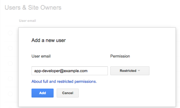
1. Give your app developer access to Webmaster Tools
App indexing is a team effort between you (as a webmaster) and your app development team. We show information in Webmaster Tools that is key for your app developers to do their job well. Here’s what’s available right now:
- Errors in indexed pages within apps
- Weekly clicks and impressions from app deep link via Google search
- Stats on your sitemap (if that’s how you implemented the app deep links)
…and we plan to add a lot more in the coming months!
We’ve noticed that very few developers have access to Webmaster Tools. So if you want your app development team to get all of the information they need to fix app-related issues, it’s essential for them to have access to Webmaster Tools.
Any verified site owner can add a new user. Pick restricted or full permissions, depending on the level of access you’d like to give:
2. Understand how your app is doing in search results
How are users engaging with your app from search results? We’ve introduced two new ways for you to track performance for your app deep links:
- We now send a weekly clicks and impressions update to the Message center in your Webmaster Tools account.
- You can now track how much traffic app deep links drive to your app using referrer information – specifically, the referrer extra in the ACTION_VIEW intent. We’re working to integrate this information with Google Analytics for even easier access. Learn how to track referrer information on our Developer site.
3. Make sure key app resources can be crawled
Blocked resources are one of the top reasons for the “content mismatch” errors you see in Webmaster Tools’ Crawl Errors report. We need access to all the resources necessary to render your app page. This allows us to assess whether your associated web page has the same content as your app page.
To help you find and fix these issues, we now show you the specific resources we can’t access that are critical for rendering your app page. If you see a content mismatch error for your app, look out for the list of blocked resources in “Step 5” of the details dialog:

4. Watch out for Android App errors
To help you identify errors when indexing your app, we’ll send you messages for all app errors we detect, and will also display most of them in the “Android apps” tab of the Crawl errors report.
In addition to the currently available “Content mismatch” and “Intent URI not supported” error alerts, we’re introducing three new error types:
- APK not found: we can’t find the package corresponding to the app.
- No first-click free: the link to your app does not lead directly to the content, but requires login to access.
- Back button violation: after following the link to your app, the back button did not return to search results.
In our experience, the majority of errors are usually caused by a general setting in your app (e.g. a blocked resource, or a region picker that pops up when the user tries to open the app from search). Taking care of that generally resolves it for all involved URIs.
Good luck in the pursuit of appiness! As always, if you have questions, feel free to drop by our Webmaster help forum.
Posted by Mariya Moeva, Webmaster Trends Analyst
Are you a robot? Introducing “No CAPTCHA reCAPTCHA”
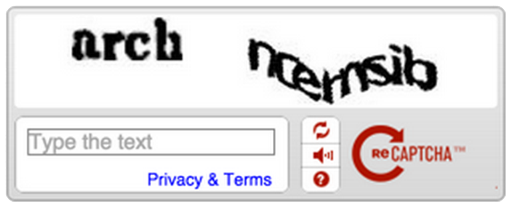
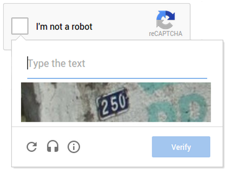
reCAPTCHA protects the websites you love from spam and abuse. So, when you go online—say, for some last-minute holiday shopping—you won’t be competing with robots and abusive scripts to access sites. For years, we’ve prompted users to confirm they aren’t robots by asking them to read distorted text and type it into a box, like this:
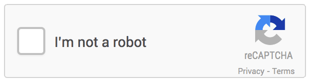
But, we figured it would be easier to just directly ask our users whether or not they are robots—so, we did! We’ve begun rolling out a new API that radically simplifies the reCAPTCHA experience. We’re calling it the “No CAPTCHA reCAPTCHA” and this is how it looks:
On websites using this new API, a significant number of users will be able to securely and easily verify they’re human without actually having to solve a CAPTCHA. Instead, with just a single click, they’ll confirm they are not a robot.
A brief history of CAPTCHAs
While the new reCAPTCHA API may sound simple, there is a high degree of sophistication behind that modest checkbox. CAPTCHAs have long relied on the inability of robots to solve distorted text. However, our research recently showed that today’s Artificial Intelligence technology can solve even the most difficult variant of distorted text at 99.8% accuracy. Thus distorted text, on its own, is no longer a dependable test.
To counter this, last year we developed an Advanced Risk Analysis backend for reCAPTCHA that actively considers a user’s entire engagement with the CAPTCHA—before, during, and after—to determine whether that user is a human. This enables us to rely less on typing distorted text and, in turn, offer a better experience for users. We talked about this in our Valentine’s Day post earlier this year.
The new API is the next step in this steady evolution. Now, humans can just check the box and in most cases, they’re through the challenge.
Are you sure you’re not a robot?
However, CAPTCHAs aren’t going away just yet. In cases when the risk analysis engine can’t confidently predict whether a user is a human or an abusive agent, it will prompt a CAPTCHA to elicit more cues, increasing the number of security checkpoints to confirm the user is valid.
Making reCAPTCHAs mobile-friendly
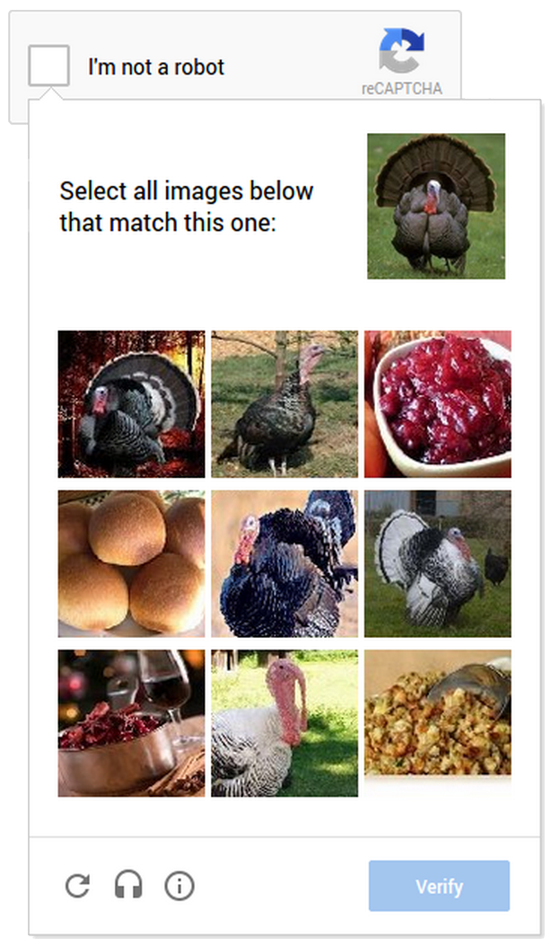
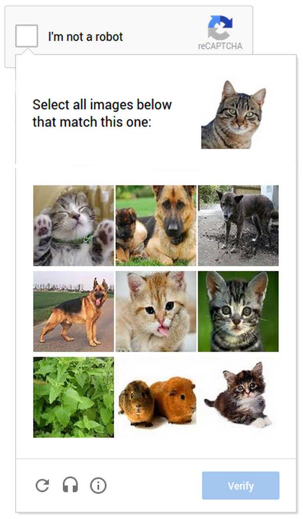
This new API also lets us experiment with new types of challenges that are easier for us humans to use, particularly on mobile devices. In the example below, you can see a CAPTCHA based on a classic Computer Vision problem of image labeling. In this version of the CAPTCHA challenge, you’re asked to select all of the images that correspond with the clue. It’s much easier to tap photos of cats or turkeys than to tediously type a line of distorted text on your phone.
Adopting the new API on your site
As more websites adopt the new API, more people will see “No CAPTCHA reCAPTCHAs”. Early adopters, like Snapchat, WordPress, Humble Bundle, and several others are already seeing great results with this new API. For example, in the last week, more than 60% of WordPress’ traffic and more than 80% of Humble Bundle’s traffic on reCAPTCHA encountered the No CAPTCHA experience—users got to these sites faster. To adopt the new reCAPTCHA for your website, visit our site to learn more.
Humans, we’ll continue our work to keep the Internet safe and easy to use. Abusive bots and scripts, it’ll only get worse—sorry we’re (still) not sorry.
Posted by Vinay Shet, Product Manager, reCAPTCHA
Tracking mobile usability in Webmaster Tools
Webmaster Level: intermediate
Mobile is growing at a fantastic pace – in usage, not just in screen size. To keep you informed of issues mobile users might be seeing across your website, we’ve added the Mobile Usability feature to Webmaster Tools.
The new feature shows mobile usability issues we’ve identified across your website, complete with graphs over time so that you see the progress that you’ve made.
A mobile-friendly site is one that you can easily read & use on a smartphone, by only having to scroll up or down. Swiping left/right to search for content, zooming to read text and use UI elements, or not being able to see the content at all make a site harder to use for users on mobile phones. To help, the Mobile Usability reports show the following issues: Flash content, missing viewport (a critical meta-tag for mobile pages), tiny fonts, fixed-width viewports, content not sized to viewport, and clickable links/buttons too close to each other.

We strongly recommend you take a look at these issues in Webmaster Tools, and think about how they might be resolved; sometimes it’s just a matter of tweaking your site’s template! More information on how to make a great mobile-friendly website can be found in our Web Fundamentals website (with more information to come soon).
If you have any questions, feel free to join us in our webmaster help forums (on your phone too)!
Posted by John Mueller, Webmaster Trends Analyst, Zurich
Industrial Strength Link Analysis With LinkResearchTools
In a competitive niche? Columnist Stephan Spencer explains how to use one tool to uncover the good, the bad and the opportunities.
The post Industrial Strength Link Analysis With LinkResearchTools appeared first on Search Engine Land.
Please visit Se…
An update to the Webmaster Tools API
Webmaster level: advanced
Over the summer the Webmaster Tools team has been cooking up an update to the Webmaster Tools API. The new API is consistent with other Google APIs, makes it easier to authenticate for apps or web-services, and provides access to some of the main features of Webmaster Tools.
If you’ve used other Google APIs, getting started with the new Webmaster Tools API will be easy! We have examples for Python, Java, as well as OACurl (for fans of command lines).
This API allows you to:
- list, add, or remove sites from your account (you can currently have up to 500 sites in your account)
- list, add, or remove sitemaps for your websites
- get warning, error, and indexed counts for individual sitemaps
- get a time-series of all kinds of crawl errors for your site
- list crawl error samples for specific types of errors
- mark individual crawl errors as “fixed” (this doesn’t change how they’re processed, but can help simplify the UI for you)
We’d love to see what you’re building with our APIs! Feel free to link to your projects in the comments below. Should you have any questions about the usage of the API, feel free to post in our help forum as well.
Posted by John Mueller, fan of long command lines, Google Zürich
Optimizing for Bandwidth on Apache and Nginx
Webmaster level: advancedEveryone wants to use less bandwidth: hosts want lower bills, mobile users want to stay under their limits, and no one wants to wait for unnecessary bytes. The web is full of opportunities to save bandwidth: pages served withou…
HTTPS as a ranking signal
Webmaster level: all
Security is a top priority for Google. We invest a lot in making sure that our services use industry-leading security, like strong HTTPS encryption by default. That means that people using Search, Gmail and Google Drive, for example, automatically have a secure connection to Google.
Beyond our own stuff, we’re also working to make the Internet safer more broadly. A big part of that is making sure that websites people access from Google are secure. For instance, we have created resources to help webmasters prevent and fix security breaches on their sites.
We want to go even further. At Google I/O a few months ago, we called for “HTTPS everywhere” on the web.
We’ve also seen more and more webmasters adopting HTTPS (also known as HTTP over TLS, or Transport Layer Security), on their website, which is encouraging.
For these reasons, over the past few months we’ve been running tests taking into account whether sites use secure, encrypted connections as a signal in our search ranking algorithms. We’ve seen positive results, so we’re starting to use HTTPS as a ranking signal. For now it’s only a very lightweight signal — affecting fewer than 1% of global queries, and carrying less weight than other signals such as high-quality content — while we give webmasters time to switch to HTTPS. But over time, we may decide to strengthen it, because we’d like to encourage all website owners to switch from HTTP to HTTPS to keep everyone safe on the web.

In the coming weeks, we’ll publish detailed best practices (we’ll add a link to it from here) to make TLS adoption easier, and to avoid common mistakes. Here are some basic tips to get started:
- Decide the kind of certificate you need: single, multi-domain, or wildcard certificate
- Use 2048-bit key certificates
- Use relative URLs for resources that reside on the same secure domain
- Use protocol relative URLs for all other domains
- Check out our Site move article for more guidelines on how to change your website’s address
- Don’t block your HTTPS site from crawling using robots.txt
- Allow indexing of your pages by search engines where possible. Avoid the noindex robots meta tag.
If your website is already serving on HTTPS, you can test its security level and configuration with the Qualys Lab tool. If you are concerned about TLS and your site’s performance, have a look at Is TLS fast yet?. And of course, if you have any questions or concerns, please feel free to post in our Webmaster Help Forums.
We hope to see more websites using HTTPS in the future. Let’s all make the web more secure!
Posted by Zineb Ait Bahajji and Gary Illyes, Webmaster Trends Analysts
Introducing the Google News Publisher Center
(Cross-posted on the Google News Blog)
Webmaster level: All
If you’re a news publisher, your website has probably evolved and changed over time — just like your stories. But in the past, when you made changes to the structure of your site, we might not have discovered your new content. That meant a lost opportunity for your readers, and for you. Unless you regularly checked Webmaster Tools, you might not even have realized that your new content wasn’t showing up in Google News. To prevent this from happening, we are letting you make changes to our record of your news site using the just launched Google News Publisher Center.
With the Publisher Center, your potential readers can be more informed about the articles they’re clicking on and you benefit from better discovery and classification of your news content. After verifying ownership of your site using Google Webmaster Tools, you can use the Publisher Center to directly make the following changes:
- Update your news site details, including changing your site name and labeling your publication with any relevant source labels (e.g., “Blog”, “Satire” or “Opinion”)
- Update your section URLs when you change your site structure (e.g., when you add a new section such as http://example.com/2014commonwealthgames or http://example.com/elections2014)
- Label your sections with a specific topic (e.g., “Technology” or “Politics”)
Whenever you make changes to your site, we’d recommend also checking our record of it in the Publisher Center and updating it if necessary.
Try it out, or learn more about how to get started.
At the moment the tool is only available to publishers in the U.S. but we plan to introduce it in other countries soon and add more features. In the meantime, we’d love to hear from you about what works well and what doesn’t. Ultimately, our goal is to make this a platform where news publishers and Google News can work together to provide readers with the best, most diverse news on the web.
Posted by Eric Weigle, Software Engineer
How To Improve Shopping Ad Performance & Quality Score In AdWords
By late August, Product Listing campaigns for AdWords will be retired in favor of Shopping campaigns, so if you haven’t started migrating, don’t delay much longer. You can run both campaign types simultaneously, so start tweaking Shopping campaigns now so that they’ll be performing great by the…
Please visit Search Engine Land for the full article.
A Marketer’s Guide To Using Regular Expressions In SEO
Regular expressions (regex) are one of the most powerful tools we have in our SEO arsenal, but they’re incredibly intimidating! Here are some tips and tricks from one SEO to another that I hope will help you dip your toes into the powerful world of regex. I must begin with a disclaimer:…
Please visit Search Engine Land for the full article.
Making your site more mobile-friendly with PageSpeed Insights
Webmaster level: all

To help developers and webmasters make their pages mobile-friendly, we recently updated PageSpeed Insights with additional recommendations on mobile usability.
Poor usability can diminish the benefits of a fast page load. We know the average mobile page takes more than 7 seconds to load, and by using the PageSpeed Insights tool and following its speed recommendations, you can make your page load much faster. But suppose your fast mobile site loads in just 2 seconds instead of 7 seconds. If mobile users still have to spend another 5 seconds once the page loads to pinch-zoom and scroll the screen before they can start reading the text and interacting with the page, then that site isn’t really fast to use after all. PageSpeed Insights’ new User Experience rules can help you find and fix these usability issues.
These new recommendations currently cover the following areas:
- Configure the viewport: Without a meta-viewport tag, modern mobile browsers will assume your page is not mobile-friendly, and will fall back to a desktop viewport and possibly apply font-boosting, interfering with your intended page layout. Configuring the viewport to width=device-width should be your first step in mobilizing your site.
- Size content to the viewport: Users expect mobile sites to scroll vertically, not horizontally. Once you’ve configured your viewport, make sure your page content fits the width of that viewport, keeping in mind that not all mobile devices are the same width.
- Use legible font sizes: If users have to zoom in just to be able read your article text on their smartphone screen, then your site isn’t mobile-friendly. PageSpeed Insights checks that your site’s text is large enough for most users to read comfortably.
- Size tap targets appropriately: Nothing’s more frustrating than trying to tap a button or link on a phone or tablet touchscreen, and accidentally hitting the wrong one because your finger pad is much bigger than a desktop mouse cursor. Make sure that your mobile site’s touchscreen tap targets are large enough to press easily.
- Avoid plugins: Most smartphones don’t support Flash or other browser plugins, so make sure your mobile site doesn’t rely on plugins.
These rules are described in more detail in our help pages. When you’re ready, you can test your pages and the improvements you make using the PageSpeed Insights tool. We’ve also updated PageSpeed Insights to use a mobile friendly design, and we’ve translated our documents into additional languages.
As always, if you have any questions or feedback, please post in our discussion group.
Posted by Matthew Steele and Doantam Phan, PageSpeed Insights team