
In the modern digital economy, a website is not merely a marketing tool; it is the primary point of interaction, commerce, and information exchange for a global audience. This guide is an archive of notes and experiences collected over 20 years of studying inclusive and accessible web design, framed for the current digital landscape.
The principle of web accessibility is founded on the belief that this digital space should be open and usable by all, regardless of ability or disability.
As the inventor of the World Wide Web, Tim Berners-Lee, stated, “The power of the Web is in its universality. Access by everyone regardless of disability is an essential aspect“.
Section 1: The Tripartite Imperative for an Accessible Web
This guide reframes web accessibility not as a technical compliance checklist or a niche concern, but as a core pillar of strategic, high-quality web development, driven by a self-reinforcing tripartite imperative: legal compliance, commercial advantage, and ethical design.
Web accessibility, as defined by the World Wide Web Consortium (W3C), is the practice of designing and developing websites, tools, and technologies so that people with disabilities can use them effectively.
It enables individuals to perceive, understand, navigate, interact with, and contribute to the web. As the Royal National Institute for the Blind (RNIB) noted, “With the help of synthesised speech and Braille display technology, even completely blind people can use the Web.”
While this guide places a special focus on designing for users with visual impairments – including blindness, low vision, and colour blindness – the principles and practices discussed extend to a wide spectrum of disabilities, including auditory, cognitive, neurological, physical, and speech impairments.
The three foundational arguments for accessibility – legal, commercial, and ethical – are not isolated pillars but are deeply interconnected.
The increasing legal pressure to provide accessible digital services creates significant financial and reputational risks for non-compliant organisations.
This legal risk elevates the commercial importance of accessibility, transforming it from a cost centre into a strategic investment aimed at protecting the brand and capturing a wider market.
The resources allocated to this commercial imperative, in turn, empower designers and developers to build fundamentally better, more inclusive, and ethically sound digital products that serve the broadest possible audience. This cycle, where legal mandates drive commercial strategy and commercial strategy enables ethical implementation, forms the central thesis of modern web accessibility. It is an investment in quality, resilience, and market reach that pays dividends across the entire organisation.
Section 2: The Global Legal and Commercial Landscape of Digital Accessibility
Prioritising digital accessibility is no longer an optional extra; it is a fundamental requirement shaped by a robust and evolving international legal framework and compelling commercial realities.
Organisations that fail to recognise and adapt to this landscape face not only legal jeopardy but also significant missed market opportunities and brand damage.
2.1 United Kingdom
In the United Kingdom, the legal obligation for web accessibility is primarily established by the Equality Act 2010. This act consolidated and replaced previous landmark legislation, including the Disability Discrimination Act 1995 (DDA).
The DDA placed a legal duty on service providers to make “reasonable adjustments” to ensure disabled people could use their services. As the RNIB stated in 2005, “You now have a legal obligation – following the implementation of section 21 of the Disability Discrimination Act – to make reasonable adjustments to ensure blind and partially sighted people can access your service.”
The principles of the DDA carry through to the Equality Act 2010, which requires service providers to make “reasonable adjustments” to ensure their services, including those provided via a website, are accessible to people with disabilities.
A critical point from the DDA’s Code of Practice is that this is a proactive duty.
Service providers should not wait until a disabled person wants to use a service which they provide before they give consideration to their duty to make reasonable adjustments. […] They should anticipate the requirements of disabled people and the adjustments that may have to be made for them. — DDA Code Of Practice 1999
A disabled person has a legitimate claim if a website’s design makes it impossible or unreasonably difficult for them to access the information or services offered.
A disabled person can make a claim against you if your website makes it impossible or unreasonably difficult to access information and services. If you have not made reasonable adjustments and cannot show that this failure is justified, then you may be liable under the Act, and may have to pay compensation and be ordered by a court to change your site. — RNIB, 2005
For the public sector, the requirements are more explicit.
The Public Sector Bodies (Websites and Mobile Applications) Accessibility Regulations 2018 mandate that public sector websites and apps must be perceivable, operable, understandable, and robust.
As of October 2024, these services are monitored for compliance with the Web Content Accessibility Guidelines (WCAG) 2.2 Level AA standard.
The education sector has long been held to a specific standard under the Special Educational Needs and Disability Act (2001) (SENDA), which amended the DDA to legally bind educational establishments to ensure course-related website content is fully accessible.
It is crucial, however, to approach claims of guaranteed compliance with caution.
As stated in the 2006 Publicly Available Specification (PAS 78), a key historical document, there is no definitive, government-issued specification for a “fully accessible” website.
It is not possible to provide a definitive specification for a fully accessible website which will satisfy the requirements of the DDA. Website commissioners should therefore be sceptical if contracting companies declare that they will create websites that are ‘DDA-compliant’ or ‘compliant with the law’. — PAS 78, 2006
This legal ambiguity creates a powerful incentive to proactively adopt established, global best practices like WCAG as the most effective form of risk mitigation.
2.2 United States
In the United States, digital accessibility is governed by two key pieces of legislation: the Americans with Disabilities Act (ADA) and Section 508 of the Rehabilitation Act of 1973.
- The Americans with Disabilities Act (ADA) is a broad civil rights law prohibiting discrimination. While it does not explicitly mention websites, U.S. courts have consistently interpreted Title III of the ADA to apply to websites as “places of public accommodation,” making it applicable to the vast majority of private businesses. The ongoing legal actions against companies for inaccessible websites, brought before the Department of Justice (DOJ), serve as a constant reminder of these obligations.
- Section 508 of the Rehabilitation Act applies to federal agencies and any organisation that receives federal funding or does business with the federal government. A 2017 refresh of the law harmonised its requirements with WCAG 2.0 Level AA.
A landmark case saw the U.S. Supreme Court rule against Domino’s Pizza for maintaining a website and mobile app that were inaccessible to blind users.
As CNN reported, this was a “win for disability advocates, who have argued that if businesses do not have to maintain accessible sites, disabled people could be effectively shut out of substantial portions of the economy.”
Earlier cases, such as the 2004 settlements by New York’s Attorney General with Priceline.com and Ramada.com, also set important precedents.
2.3 European Union
The European Accessibility Act (EAA) is a directive that establishes a common set of accessibility rules for key private-sector products and services across the EU. The deadline for businesses to comply is June 28, 2025.
The EAA covers a range of digital products and services, including e-commerce websites, banking services, computers, smartphones, and e-books. The EAA mandates compliance with WCAG 2.1 Level AA as the baseline standard.
2.4 Canada
Canada’s accessibility legislation is a mix of federal and provincial laws.
The Accessible Canada Act (ACA) applies to organisations under federal jurisdiction, recommending WCAG 2.1 Level AA. Provincially, the Accessibility for Ontarians with Disabilities Act (AODA) requires public sector organisations and private businesses with 50 or more employees to make their websites compliant with WCAG 2.0 Level AA.
2.5 Australia
In Australia, the primary legislation is the Disability Discrimination Act 1992 (DDA), which makes it unlawful to discriminate against a person on the grounds of disability. This protection extends to websites and other digital resources.
A landmark case against the Sydney Olympics Committee in 2000 resulted in a decision against the website owners, highlighting the long-standing legal imperative for digital access. The Australian Human Rights Commission’s guidelines point to WCAG 2.2 Level AA as the benchmark for ensuring non-discriminatory access.
2.6 The Commercial and Socio-Economic Case for Accessibility
Beyond legal compliance, there is a powerful business case for embedding accessibility into digital strategy.
As Google’s Webmaster Guidelines state, you should “Ensure that your pages are useful for readers with visual impairments, for example, by testing usability with a screen-reader.” Ignoring the vast market of users with disabilities is a significant commercial oversight.
- In the United Kingdom, there are an estimated 16.1 million people with a disability (24% of the population), and the total spending power of families with at least one disabled person is estimated at £274 billion a year.
- In the United States, 44.7 million people (13.6% of the civilian noninstitutionalized population) had a disability in 2023.
- In the European Union, approximately 27% of the population aged 16 and over reports having some form of disability.
- In Canada, 8.0 million people aged 15 and over (27% of the population) had one or more disabilities in 2022.
- In Australia, 5.5 million people (21.4% of the population) had a disability in 2022.
This commercial imperative is deepened by a stark socio-economic reality.
Life costs more for disabled people. In the UK, the “Disability Price Tag” report found that disabled households face an average of £975 in extra costs each month just to have the same standard of living as non-disabled households.
This financial pressure is compounded by higher rates of poverty and lower median incomes. Inaccessible digital services exacerbate this inequality, creating barriers to essential services, employment, and commerce.
To exclude these users is to willingly cede a large portion of the potential market to competitors. Furthermore, the benefits of accessible design practices extend far beyond the primary audience, creating an “Accessibility Dividend” that improves the experience for all users.
- Enhanced Search Engine Optimisation (SEO): Many accessibility best practices directly align with SEO best practices. The use of logical heading structures, descriptive link text, and alternative text for images helps search engine crawlers better understand and index a page’s content, which can lead to improved search rankings.
- Improved Overall User Experience (UX): Principles such as clear and consistent navigation, readable font sizes, sufficient colour contrast, and plain language create a more intuitive and less frustrating experience for every visitor, not just those with disabilities.
- Broader Device and Context Compatibility: Techniques that enable accessibility also improve usability for individuals in varied situations. For example, a website that is designed to be accessible to users of assistive technology is often more usable for people with slow internet connections or those accessing the site on mobile devices with smaller screens. Captioned videos benefit users in noisy environments where they cannot hear audio, as well as non-native speakers who may find it easier to read along.
Investing in accessibility is not about accommodating a small minority; it is about implementing a universal design philosophy that results in a more robust, usable, and commercially successful product for everyone.
Section 3: Foundations of Accessibility: A Deep Dive into WCAG and the POUR Principles
To navigate the complexities of creating accessible websites, developers and designers need a reliable framework. This framework is provided by the World Wide Web Consortium (W3C), the main international standards organisation for the World Wide Web.
Through its Web Accessibility Initiative (WAI), the W3C develops technical specifications and guidelines to advance accessibility for people with disabilities.
The most critical resource produced by the WAI is the Web Content Accessibility Guidelines (WCAG). WCAG is the globally recognised, technology-neutral standard for web accessibility, providing a comprehensive set of recommendations for making web content more accessible. Adherence to WCAG is the most effective way to meet moral obligations, achieve commercial benefits, and mitigate the legal risks previously discussed. Each guideline has one or more ‘checkpoints’ assigned a priority level based on its impact.
WCAG Priority Levels:
- Priority 1 (Level A): Web developers MUST satisfy these checkpoints; otherwise, some groups will find it impossible to access information. This is the minimum level of conformance.
- Priority 2 (Level AA): Web developers SHOULD satisfy these checkpoints; otherwise, some groups will find it difficult to access information. This is the preferred level of conformance.
- Priority 3 (Level AAA): Web developers MAY satisfy these checkpoints to make it easier for the majority of users to access all information. This is the optimum level of conformance.
The entire WCAG framework is built upon four foundational principles that provide a human-centric approach to accessibility.
These principles, easily remembered by the acronym POUR, shift the focus from a simple technical checklist to the actual experience of the user. Instead of asking “Did I add the tag?”, this framework forces the developer to ask “Can my user accomplish their goal?”.
Perceivable
Information and user interface components must be presentable to users in ways they can perceive. This means that users must be able to perceive the information being presented; it can’t be invisible to all of their senses.
- Example: For a user who is blind, an image is not perceivable. Providing descriptive alternative text (alt text) makes the information contained in that image perceivable through a screen reader, which converts the text to speech or Braille.
Operable
User interface components and navigation must be operable. This means that users must be able to operate the interface; the interface cannot require interaction that a user cannot perform.
- Example: A user with a motor impairment who cannot use a mouse must be able to perform all actions and navigate to all parts of a website using only a keyboard. If a dropdown menu can only be opened with a mouse click, it is not operable for this user.
Understandable
Information and the operation of the user interface must be understandable. This means that users must be able to understand the information as well as the operation of the user interface; the content or operation cannot be beyond their understanding.
- Example: A website with an inconsistent navigation menu that changes on every page can be confusing for users, especially those with cognitive disabilities. Using a consistent, predictable navigation structure helps users learn the site’s layout and navigate it with confidence.
Robust
Content must be robust enough that it can be interpreted reliably by a wide variety of user agents, including assistive technologies. This means that as technologies and user agents evolve, the content should remain accessible.
- Example: Using clean, standards-compliant HTML ensures that the content can be correctly interpreted by different web browsers, mobile devices, and assistive technologies like screen readers, both today and in the future.
These four principles provide the essential structure for all specific accessibility guidelines. By organising best practices under this human-centric framework, we can ensure that our efforts are focused not merely on technical compliance but on creating genuinely usable and inclusive digital experiences.
Section 4: Principle 1: Designing for Perception
For a website to be accessible, its content must first be perceivable by the user.
This principle addresses the sensory aspects of the user experience, ensuring that information can be consumed through sight, sound, or touch. This involves careful consideration of visual design elements and providing robust alternatives for any content that is not purely text-based.
4.1 Visual Clarity: Colour, Contrast, and Typography
A clear visual presentation is the foundation of a perceivable design. For users with low vision or colour blindness, choices related to colour, contrast, and typography can be the difference between a usable website and an incomprehensible one.
Colour and Contrast: Sufficient contrast between the text (foreground) and its background is one of the most critical factors for readability. As usability expert Jakob Nielsen advises, “Maximise the colour contrast between the text and the background (and do not use busy or watermarked background patterns).” WCAG provides specific, measurable ratios to guide this effort. To meet the widely adopted Level AA standard, designs should adhere to the following minimums:
- A contrast ratio of at least for normal-sized text.
- A contrast ratio of at least for large text (defined as 18 point/24 pixel, or 14 point/19 pixel if bold).
- A contrast ratio of at least for graphical objects and user interface components (such as the borders of a form field).
Numerous free online tools, such as the WebAIM Contrast Checker, can be used to test colour combinations and ensure they meet these requirements.
Critically, colour must not be used as the sole means of conveying information. When information is presented by colour alone, a person who is color blind misses that information. It is best to use multiple attributes; for example, if both colour and a fill pattern are used on different bars in a graph, they can be viewed in either colour or black and white. Other reinforcements include:
- Adding a textual label, such as an asterisk (*) and the word “required”.
- Using an icon in addition to colour for error messages or alerts.
- Underlining links in body text to distinguish them from non-interactive text, rather than relying on colour alone. As the European Blind Union recommends, “It is recommended to underline all links inside a text block.”
Typography: The choice and presentation of text have a profound impact on readability.
- Font Size: There is no single “best font size.” The key is flexibility. As Jakob Nielsen advises, “Do not use absolute font sizes in your style sheets. Code font sizes in relative terms, typically using percentages such as 120% for big text and 90% for small text.” This allows users to zoom in on text up to 200% without loss of content or functionality. While Google has not specified an exact font size for ranking, it recommends a minimum of 16px for readability, and the May 2024 leak of its internal documentation confirmed that it stores and uses attributes like “the average weighted font size of a term in the doc body”.
- Typeface: Choose typefaces that are designed for legibility. Good choices often have a large x-height (the height of a lowercase ‘x’) and feature clearly distinct letterforms, preventing confusion between characters like ‘I’, ‘l’, and ‘1’, or ‘0’ and ‘O’. While sans-serif fonts are often recommended for user interfaces, the primary consideration is clarity.
- Line Spacing and Length: Readability is improved with adequate spacing. For body text, a line height (leading) of around to times the font size is recommended. Line length should also be controlled to avoid reader fatigue; an optimal range is between 45 and 75 characters per line.
4.2 Alternatives for Non-Text Content
Any content that is not text – such as images, videos, and audio clips – is inherently inaccessible to some users. To make this content perceivable, textual alternatives must be provided.
Images and Alt Text: Every informative image on a webpage must have alternative text (alt text). This is a concise, textual description of the image’s content and function, provided via the alt attribute in the HTML <img> tag. A screen reader will announce the presence of an image and then read the alt text aloud, allowing a user who is blind to understand its purpose.
- Effective Alt Text: The description should be descriptive but succinct. It should convey the same information or function that a sighted user would get from the image. Avoid embedding text within a graphic, as it cannot be resized or read by screen readers.
- Decorative Images: If an image is purely for decoration and provides no information, it should have an empty alt attribute (
alt=""). This signals to screen readers that the image can be safely ignored, preventing unnecessary auditory clutter.
Audio and Video: Multimedia content requires multiple forms of alternatives to be fully perceivable.
- Captions: All videos with audio must have synchronised, accurate captions. Captions provide a text equivalent for the spoken dialogue and other important sounds, making the content accessible to users who are deaf or hard of hearing.
- Transcripts: As the European Blind Union notes, “the Web Content Accessibility Guidelines ask that video is captioned for the deaf and that a text transcript is available.” A full text transcript of all spoken content should be provided for both audio and video files. This benefits not only users who are deaf but also those who prefer to read the content or search for specific information within it.
- Audio Descriptions: For videos where important visual information is not conveyed through the dialogue, an audio description is necessary. This is a separate audio track where a narrator describes key visual elements, such as actions, characters, scene changes, and on-screen text, making the content accessible to users who are blind or have low vision. The HTML5
<track>element can be used to programmatically associate these text-based tracks with a media element.
By focusing on visual clarity and providing robust alternatives, we ensure that the foundational layer of information on a website is perceivable to the widest possible audience.
Section 5: Principle 2: Engineering an Operable Interface
Once content is perceivable, users must be able to interact with it. The principle of operability ensures that all interactive components—from links and buttons to complex forms and media players – can be controlled by any user, regardless of the input device they use.
This is particularly crucial for users with motor disabilities who may not be able to use a mouse, and for blind users who rely on screen readers and keyboard commands to navigate.
5.1 Keyboard-First Navigation
The single most important test of an operable interface is whether it can be used entirely without a mouse.
A person with a visual disability will not find the mouse useful because it requires hand-eye coordination. Instead, they must navigate using only the keyboard. The Tab key is used to move focus between items, a screen reader announces the item, and the user presses Enter to activate it.
Full keyboard accessibility is a foundational requirement because a screen reader’s navigation is fundamentally keyboard-based. If an element cannot be reached or activated with a keyboard, it is functionally non-existent for many users with disabilities.
- All Functionality: Every interactive element, including links, buttons, form fields, and media controls, must be accessible and operable using the keyboard. Users should be able to navigate through all elements using the
Tabkey (andShift+Tabto go backwards) and activate them using keys likeEnterorSpace. - Visible Focus: It is not enough for an element to be keyboard-accessible; the user must be able to see which element is currently active. A clear and highly visible focus indicator (such as a prominent border or outline) is essential. This is typically styled in CSS using the
:focuspseudo-class, which should be given the same design consideration as the:hoverstate for mouse users. - Logical Tab Order: The order in which interactive elements receive focus when tabbing through the page should be logical and predictable, typically following the visual reading order of the page (e.g., left-to-right, top-to-bottom in Western languages).
- No Keyboard Traps: A keyboard trap occurs when a user can navigate into a component (like a pop-up modal or a third-party widget) but cannot navigate out of it using only the keyboard. It is critical to ensure that focus can always be moved away from any component without getting stuck.
- Skip Links: Provide a “skip to main content” link at the very top of each page. This allows keyboard and screen reader users to bypass repetitive navigation menus and jump directly to the primary content of the page, saving time and effort.
5.2 Building Accessible Forms
Forms are one of the most critical interactive components of the web, used for everything from logging in to making a purchase. Inaccessible forms can create insurmountable barriers for users.
- Explicit Labels: Every form input, checkbox, and radio button must have a programmatically associated
<label>element. As the European Blind Union advises, “In a form, it is essential to mark up all instructions (e.g. first name, street, country …) with a label element. Then link each label with the corresponding form field.” Clicking on the label should place focus on its corresponding input. For screen reader users, this label is what announces the purpose of the form field, making it essential for understanding. - Clear Instructions and Layout: Present forms in a simple, single-column layout where possible, as this creates a clear downward momentum for users. Instructions should be persistent and visible. Do not use placeholder text within an input field to provide critical instructions, as this text disappears once the user starts typing and is often ignored by assistive technologies. Mandatory fields should be identified in a non-visual way, not just with colour.
- Robust Error Handling: When a user makes an error, the error message must be highly visible, specific, and easy to understand. Use multiple cues—such as colour, an icon, bold text, and a heavy border—to draw attention to the field in error. The message should clearly explain what the error is and how to fix it. For screen reader users, it is important that errors are announced automatically when they occur.
- Grouping Related Fields: When a form contains a group of related controls, such as a set of radio buttons for a single question, they should be grouped together using the
<fieldset>element. The overarching question or prompt for the group should be provided in a<legend>element. This provides essential context for screen reader users, who will hear the legend announced as they navigate through the options within the fieldset. - Avoid CAPTCHA: Avoid techniques like CAPTCHA that require a user to type a code from an image. This code cannot be read by a screen reader and is often difficult for partially sighted people to decipher.
5.3 User Control and Operability
Operability also means giving users control over the experience and ensuring interactive elements are easy to use.
- Moving Content: For any moving, blinking, or scrolling content, such as image carousels, animations, or auto-playing videos, there must be a user control to pause, stop, or hide it. Content that flashes more than three times per second must be avoided, as it can trigger seizures in individuals with photosensitive epilepsy.
- Time Limits: If a web page includes a time limit for a task (such as filling out a form), the user must be given options to turn off, adjust, or extend that time limit. Many users, particularly those using assistive technology, require more time to read and complete tasks.
- Target Size: For users with motor impairments or those using touch screens, interactive elements like buttons and links should have a sufficiently large target area to be easily activated. The WCAG 2.2 standard introduces a minimum target size of 24 by 24 CSS pixels for most controls.
By engineering an interface that is fully operable via keyboard, provides clear and accessible forms, and gives users control over dynamic content, we ensure that all users can successfully interact with and navigate a website.
Section 6: Principle 3: Creating Understandable and Predictable Experiences
An accessible website must be more than just perceivable and operable; its content and functionality must also be understandable. This principle addresses the cognitive aspects of web use, ensuring that users can comprehend the information presented and predict how the interface will behave.
This is achieved through clear language, consistent navigation, and a logical, well-organised structure.
For a user who navigates visually, the user interface (UI) is the layout of elements, the use of colour, and the graphical design. For a non-visual user relying on a screen reader, the UI is fundamentally different: it is the document’s underlying semantic structure.
The page title, the hierarchy of headings, and the text of the links are not just content; they are the primary interactive components of this non-visual UI. Ignoring this “secondary UI” is equivalent to designing a graphical interface with randomly placed, unlabeled buttons.
6.1 Structural Integrity and Semantics
A well-structured document is the backbone of an understandable experience for assistive technology users.
- Headings: A logical and correctly nested heading hierarchy (
<h1>,<h2>,<h3>, etc.) is the single most important structural element for screen reader users. It creates a virtual outline of the page, allowing users to quickly “skim” the content by navigating from heading to heading to understand its organization and find the information they need. It is critical to use heading levels in the correct order and not to skip levels (e.g., jumping from an<h1>to an<h3>). Headings should be used for structure, not just for styling text. - Semantic HTML: Using HTML elements according to their intended purpose provides inherent meaning and structure to the page. The European Blind Union notes that “In HTML structure elements exist for paragraphs (p), headings and subtitles (h1, h2, … h6), lists (ul, ol and li).” Elements like
<nav>(for navigation),<main>(for the primary content),<header>, and<footer>programmatically define the different regions of a page. This allows assistive technology users to quickly jump to key sections, dramatically improving navigation efficiency.
6.2 Navigation and Wayfinding
Consistency and clarity are paramount for helping users orient themselves and navigate a site with confidence.
- Consistent Navigation: Navigation menus and other recurring components should be named, styled, and positioned consistently across every page of a website. This creates a predictable pattern that helps users, especially those with cognitive disabilities, learn how to use the site quickly.
- Descriptive Link Text: The text of a link must clearly and accurately describe its destination. Vague and generic phrases like “Click Here,” “Read More,” or “Learn More” are highly problematic. Screen reader users often generate a list of all links on a page to navigate; in this context, a list of a dozen “Click Here” links is completely meaningless. Good link text makes sense even when read out of context and benefits all users by improving the scannability of the page.
- Descriptive Page Titles: Every web page must have a unique and descriptive
<title>element. The page title is typically the first piece of information a screen reader announces when a new page loads. A clear title, such as “Contact Us – Acme Corporation,” immediately orients the user and confirms they have arrived at the correct destination, saving valuable time and reducing confusion.
6.3 Readability and Language
The content itself must be understandable.
- Plain Language: Whenever possible, use clear and simple language. Avoid jargon, complex sentences, and unnecessary acronyms. This is particularly helpful for users with cognitive or learning disabilities, non-native speakers, and users who are deaf or hard of hearing, as sign language is a different language from written English.
- Specify Language: Use the
langattribute in your HTML (e.g.,<html lang="en">) to declare the default language of the page. This allows screen readers to switch to the correct voice profile and pronounce words accurately. - Layout and Spacing: A clean, uncluttered layout makes content easier to read and understand. Use generous whitespace and proximity to visually group related content, helping users to scan the page and make sense of the relationships between different elements.
6.4 Designing for Cognitive and Learning Disabilities
Beyond visual and motor impairments, creating an understandable experience means designing for users with cognitive disabilities such as dyslexia or attention disorders.
People with dyslexia, for example, often find it difficult to “decode” words and maintain focus. The following 17 tips (contributed by Jack from Pickards.co.uk, many years ago, when I first wrote this article), adapted from years of practical application. can create a more comfortable reading experience:
- Text Size: The minimum recommended font size for users with dyslexia is 12pt.
- Text Scaling: Use a scalable font size (e.g.,
%orem) so users can adjust text to their needs. - Font Style: Use a rounded, sans-serif font like Arial, Comic Sans, or Verdana that is easy on the eye.
- Capitalisation: Avoid using all caps for emphasis, as it is harder to read and can feel like shouting.
- Background: An off-white or cream background can be easier to read from than pure white. Avoid patterned or busy backgrounds.
- Spacing: Use generous line spacing between paragraphs to break up large blocks of text.
- Justification: Do not right-justify text. This creates uneven spacing between words (“rivers of white”) that is distracting and difficult to read.
- Italics: Avoid italics, as they make text more difficult to parse. Use bold for emphasis instead.
- Paragraphs: Keep paragraphs short and focused on a single idea.
- Lists: Use bulleted or numbered lists to break up continuous prose. Number menu items where appropriate.
- Writing Style: Use short words and simple sentences. Refer to the reader as “you.”
- Navigation: Ensure navigation is simple and stays the same across the site. A site map and search facility are helpful.
- Moving Text: Do not use moving, scrolling, or flashing text, as it creates significant problems for users with dyslexia and other visual impairments.
- Columns: Keep columns of text no more than 70-80 characters wide to make it easier for the eye to track from one line to the next.
- Pictures: Use pictures to aid comprehension where appropriate.
- Document Structure: Use a clear and logical document structure with headings, lists, and indented quotes to make the content easier to understand.
- Abbreviations: Always expand the first occurrence of any abbreviation on a page.
By building a logical structure, providing predictable navigation, and using clear language, we create an experience that is not only accessible but also more intuitive and user-friendly for every visitor.
Section 7: Principle 4: Building for Robustness and Future Compatibility
The final principle of accessibility, robustness, ensures that web content can be reliably interpreted by a wide variety of user agents, including current and future web browsers, mobile devices, and assistive technologies.
A robust website is built on a foundation of clean, standards-compliant code, using technologies for their intended purpose. This forward-looking approach ensures that the investment in accessibility is durable and will not easily break as technology evolves.
7.1 The Power of Semantic HTML
The cornerstone of a robust website is the correct use of semantic HTML. This means using clean, validated HTML that adheres to web standards and using HTML elements for their intended purpose.
- Use Native Elements First: Whenever a native HTML element exists that provides the desired functionality, it should be used. For example, use a
<button>element for an action that performs a function on the current page, and an<a>element for navigation to another page. These native elements have built-in keyboard accessibility and are universally understood by browsers and assistive technologies. - Use Tables for Data Only: Do not use
<table>elements for visual layout. Tables should be reserved for presenting tabular data. When doing so, use<th>for headers to associate them with data cells and provide a<caption>element to describe the table’s contents. - Validation: Regularly validating HTML against W3C standards helps to catch errors and ensure that the code is well-formed, which improves its chances of being interpreted correctly by all user agents.
- Universal Design Over Text-Only Versions: A robust site practices ‘universal design’ – a single version that is accessible to everyone. The RNIB encourages this approach, noting that creating a separate text-only version often leads to it being neglected and out-of-date. As the UK Government guidelines state, “Alternative text-only pages should rarely be necessary and are not best practice.” The W3C recommends a text-only page only as a last resort.
7.2 Leveraging ARIA for Rich Applications
While native HTML should always be the first choice, modern web applications often include complex, dynamic components (like custom dropdown menus, sliders, or live-updating content feeds) that do not have a direct native HTML equivalent.
For these situations, the Accessible Rich Internet Applications (ARIA) specification provides a way to add the necessary semantics.
- What ARIA Does: ARIA allows developers to add special attributes to HTML elements to define their roles (e.g.,
role="slider"), states (e.g.,aria-checked="true"), and properties (e.g.,aria-labelledby="label-id"). This provides information to assistive technologies that is not available from the native HTML alone. For example,aria-live="polite"can be added to a region of the page to signal that screen readers should announce any updates to that region without interrupting the user’s current task. - The First Rule of ARIA: The most important principle of ARIA is to use it sparingly. If a native HTML element or attribute can provide the necessary semantics, use it instead of ARIA. For example, do not add
role="button"to a<button>element, as it is redundant. ARIA is a supplement to, not a replacement for, semantic HTML. - HTML5 and ARIA Landmark Roles: Modern HTML5 introduced several semantic elements that map directly to ARIA’s landmark roles, simplifying the process of defining page structure. Using these native elements is now the preferred method.
7.3 Designing for Different Viewports
Robustness also means ensuring that a website works effectively across a wide range of devices and screen sizes.
A responsive, fluid design that adapts to different viewports – from large desktop monitors to small mobile phone screens – is essential.
The layout should reflow gracefully, and text should remain readable without requiring horizontal scrolling, even when a user has zoomed in significantly. All functionality must be available and usable regardless of the device or screen orientation.
By building on a solid foundation of standards-compliant code and using advanced technologies like ARIA judiciously, we create digital products that are not only accessible today but are also prepared for the technological landscape of tomorrow.
Section 8: A Practical Accessibility Toolkit: Tools and Testing Strategies
Achieving and maintaining web accessibility is an ongoing process, not a one-time project.
A comprehensive auditing strategy is essential for identifying and remediating barriers. An effective strategy does not rely on a single method but instead employs a multi-layered approach that combines the broad reach of automated tools, the nuanced analysis of manual checks, and the invaluable, real-world insights of user testing.
8.1 Automated Testing Tools
Automated tools are the first line of defence in an accessibility audit. They are fast, can be integrated into development workflows, and are excellent for catching a high volume of common, code-based issues.
- Browser Extensions: These tools allow for quick, on-the-fly evaluation of any webpage directly in your browser. They are ideal for developers and content creators for instant feedback.
- WAVE (Web Accessibility Evaluation Tool): Developed by WebAIM, this extension provides a visual overlay on your page, highlighting accessibility issues with icons and indicators.
- axe DevTools: Created by Deque, this is a powerful extension that integrates into browser developer tools and is known for its accuracy and low rate of false positives.
- Accessibility Insights for Web: An open-source tool from Microsoft that helps developers find and fix common issues in less than five minutes through a “FastPass” check.
- Other Notable Extensions: A wide variety of other extensions exist, including the Siteimprove Accessibility Checker, ARC Toolkit, and various color contrast checkers.
- Online Checkers: For a quick audit of a single public page, you can use a free online checker. Simply enter a URL, and the tool will generate a report. Popular options include checkers from UserWay, AudioEye, accessiBe, and AEL Data.
- Comprehensive Platforms: For larger organisations, enterprise-level platforms like Siteimprove, Deque’s axe Auditor, and accessiBe offer site-wide scanning, monitoring over time, and detailed reporting to manage accessibility across entire digital properties.
It is critical to understand that automated tools are not a complete solution. It has been estimated that they can only detect around 30-40% of all potential accessibility issues. They cannot determine if alt text is meaningful, if the keyboard tab order is logical, or if the content is understandable. A “clean” report from an automated checker does not guarantee that a site is accessible.
8.2 Essential Manual Checks
The middle of the funnel consists of manual testing performed by developers, designers, and QA specialists. This stage is more time-consuming but is essential for catching the nuanced issues that automated tools miss.
- Keyboard-Only Navigation: As previously noted, this is the single most important manual check. Attempt to use the entire website—navigating all menus, activating all controls, and filling out all forms—using only the keyboard. Key things to check for are whether all interactive elements are reachable, whether the focus indicator is always visible, and whether there are any keyboard traps.
- Screen Reader Walkthrough: Use a built-in screen reader like VoiceOver (macOS) or Narrator (Windows) to experience the site from a non-visual perspective. This will quickly reveal issues with heading structure, link text quality, image descriptions, and form accessibility.
- Content and Visual Review: Manually check that link text is descriptive, that alt text accurately conveys image content, that headings form a logical outline, and that information is not conveyed by colour alone. Zoom the page to 200% to ensure that content reflows correctly without loss of functionality.
8.3 The Gold Standard: User Testing
At the narrowest, most high-value point of the funnel is user testing. The only way to be certain that a website is truly usable is to involve people with disabilities in the testing process.
- Why It’s Essential: Users of assistive technologies are experts in their own experience. They will uncover “unknown unknowns”—barriers and usability issues that developers and designers, even with the best intentions and expertise, would never anticipate. Their real-world feedback is irreplaceable.
- The Process: Involve users with a range of disabilities (e.g., a blind screen reader user, a user with low vision who uses magnification, a user with a motor impairment who uses a switch device) and ask them to complete key tasks on the website. Observe their process, note any points of friction or confusion, and listen to their feedback.
Listen to your users.
By combining the speed of automated tools, the detail of manual checks, and the authenticity of user testing, organisations can create a robust and effective accessibility auditing strategy that moves beyond mere compliance to foster genuine digital inclusion.
Section 9: A Practitioner’s Perspective: SEO, Accessibility, and the Evolving Web
The principles outlined in this guide are not just theoretical; they are grounded in decades of practical application and are continually validated by the evolving landscape of search technology.
9.1 A Note from the Author: 20+ Years in Accessible Design
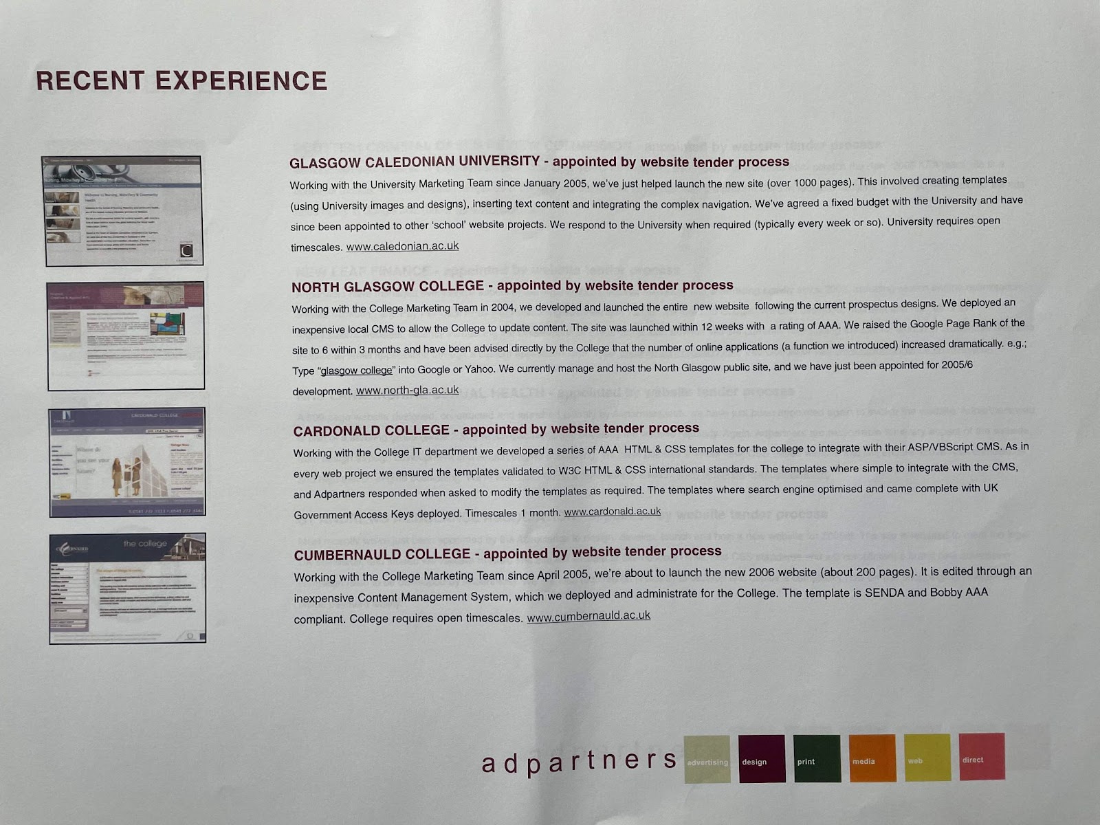
My (Shaun Anderson’s) journey into SEO began with a foundation in accessible web design and usability (at my former employer, Adpartners).
Even before founding Hobo Web, my work from 2001 onwards involved designing and building hundreds of websites for public sector organisations, including the NHS, government sites, public sites, universities and colleges in the UK, culminating in winning the Gold Award for Best Website in the SFEU Marketing Awards in 2006 for North Glasgow College (the same year I founded Hobo!).
In that environment, accessibility wasn’t optional – it was a core requirement driven by legislation like the DDA and SENDA.
This early experience demonstrated that a well-structured, semantically correct, and usable website – the hallmarks of good accessibility – was also a website that performed better for everyone, including search engines.
This philosophy of building high-quality, user-centric sites has been the cornerstone of Hobo Web’s approach ever since.
9.2 The SEO-Accessibility Link: Insights from the Google Leak
For years, the SEO community has operated on the principle that what’s good for users is good for Google. The May 2024 leak of Google’s internal Content Warehouse API documentation provided a rare glimpse into how true this is, particularly for accessibility-related factors.
While Google has publicly stated that accessibility is not a direct ranking factor, the leaked documents revealed that its systems track and use attributes that are direct proxies for a good, accessible user experience.
For instance, the documentation confirmed that Google stores information on “the average weighted font size of a term in the doc body,” validating the long-held belief that readable font sizes matter.
Furthermore, the leak provided more context on systems like NavBoost, first mentioned in the DOJ antitrust trial testimony, which uses click data (e.g., “goodClicks,” “badClicks”) to adjust rankings.
This confirms that Google measures user engagement and satisfaction, which are directly impacted by a site’s accessibility.
The leak and the Google v. DOJ antitrust court case documents confirm the existence of various site-level quality metrics, like Q-star (Google’s Quality Score), and authority metrics, such assiteAuthority, which are influenced by the overall quality and user experience of a site.
These revelations reinforce the central argument of this guide: building an accessible website is not a separate, niche task but a fundamental part of creating a high-quality, authoritative site that performs well for both users and search engines.
Section 10: The Human Element: Advocacy, History, and the Evolving Web
The journey toward a more accessible web has been driven by advocacy, technological evolution, and the dedicated work of organisations and individuals. Understanding this history provides crucial context for the standards we follow today.
10.1 The Role of Advocacy and Early Investigations
Organisations like the Royal National Institute for the Blind (RNIB) have been at the forefront of promoting accessible design. Their approach has historically focused on dialogue and conciliation over litigation. When a user reports an inaccessible site, the RNIB’s policy has been to engage in a three-way dialogue with the user and the company to resolve the issues. Legal action has always been a last resort, used only when a satisfactory conclusion cannot be reached.
In the early 2000s, the UK’s Disability Rights Commission (DRC) became concerned about the growing inaccessibility of the web. When the web began, most sites were hand-coded to W3C standards, making them relatively easy for access technologies to interpret. However, the rise of web authoring tools that did not produce compliant code created significant barriers.
In 2004, the DRC published a landmark report, ‘The Web: Access and Inclusion for Disabled People,’ which found that a staggering 81% of 1,000 British websites failed to meet even the most basic accessibility criteria.
This report highlighted a huge knowledge gap among developers and commissioners, paving the way for more formal guidance like PAS 78 and its successor, BS 8878.
10.2 The W3C and the Standardisation of the Web
The World Wide Web Consortium (W3C) was created in October 1994 by Tim Berners-Lee, the inventor of the Web, to lead the Web to its full potential by developing common protocols. Organised as a member organisation with participants from major technology companies, academic institutions, and governments, the W3C’s most important work is the development of web specifications, known as “Recommendations.”
Through its Web Accessibility Initiative (WAI), the W3C published the first version of the Web Content Accessibility Guidelines (WCAG) in 1999. These guidelines have become the definitive international standard, forming the technical foundation for nearly all web accessibility legislation around the world. The evolution from WCAG 1.0 to the current versions reflects the changing technological landscape and a deeper understanding of the diverse needs of users with disabilities. It is a testament to the principle of “cool URIs don’t change” that these standards, though evolving, remain a stable and reliable resource for developers worldwide.
References
- https://fuzzymath.com/blog/improve-accessibility-for-visually-impaired-users/
- https://www.freecodecamp.org/news/web-accessibility-best-practices/
- https://www.hobo-web.co.uk/design-website-for-blind/
- https://afb.org/digital-inclusion/accessibility-resources
- https://askearn.org/page/10-tips-for-an-accessible-website
- (https://www.w3.org/WAI/tips/designing/)
- https://digital.gov/guides/accessibility-for-teams/visual-design
- https://www.ada.gov/resources/web-guidance/
- https://www.washington.edu/accesscomputing/30-web-accessibility-tips
- https://www.siteimprove.com/glossary/uk-accessibility-laws/
- https://sc.edu/about/offices_and_divisions/digital-accessibility/toolbox/best_practices/
- https://www.accessibilitychecker.org/guides/uk-equality-act/
- https://silktide.com/blog/uk-government-websites-to-meet-wcag-2-2-from-october-2024/
- https://www.gov.uk/guidance/accessibility-requirements-for-public-sector-websites-and-apps
- https://www.siteimprove.com/glossary/uk-accessibility-laws/
- https://www.gov.uk/service-manual/helping-people-to-use-your-service/understanding-wcag
- https://www.equalweb.com/a/44521/11527/what_to_know_about_web_accessibility_laws_in_2025
- https://www.audioeye.com/post/ada-section-508-and-wcag/
- https://www.ada.gov/resources/web-rule-first-steps/
- https://www.ada.gov/resources/2024-03-08-web-rule/
- https://www.section508.gov/manage/laws-and-policies/
- https://www.state.gov/section-508-accessibility-statement
- https://commission.europa.eu/strategy-and-policy/policies/justice-and-fundamental-rights/disability/union-equality-strategy-rights-persons-disabilities-2021-2030/european-accessibility-act_en
- https://quivo.co/uk/european-accessibility-act-2025/
- https://www.tdmp.co.uk/insights/european-accessibility-act-2025-everything-you-need-know
- https://www.aoda.ca/
- https://www.siteimprove.com/blog/a-complete-overview-of-canadas-accessibility-laws/
- https://www.levelaccess.com/blog/aoda-compliance-requirements-for-websites/
- https://www.ontario.ca/page/how-make-websites-accessible
- https://www.accessibilitychecker.org/guides/aoda/
- https://www.acquia.com/web-accessibility-legislation/australian-dda
- https://www.deque.com/blog/navigating-australias-disability-discrimination-act-for-a-digitally-accessible-business/
- https://www.accessibilitychecker.org/guides/dda/
- https://humanrights.gov.au/our-work/disability-rights/publications/guidelines-equal-access-digital-goods-and-services
- https://aifs.gov.au/using-our-website/accessibility
- https://www.deque.com/apac-digital-accessibility-laws/australia/
- https://www.scope.org.uk/media/disability-facts-figures
- https://www.abs.gov.au/statistics/health/disability/disability-ageing-and-carers-australia-summary-findings/latest-release
- https://australiandisabilitynetwork.org.au/resources/disability-statistics/
- https://www150.statcan.gc.ca/n1/daily-quotidien/241008/dq241008d-eng.htm
- https://www.census.gov/newsroom/facts-for-features/2025/disabilities-act.html
- https://www.theconservative.online/people-with-disabilities-in-the-eu
- https://www.disability-europe.net/theme/statistical-indicators
- https://www.theregister.com/2024/05/29/internal_google_search_documents/
- https://www.sitecentre.com.au/blog/font-colour-size-impact-seo
- https://www.hobo-web.co.uk/shaun-anderson/
- https://ipullrank.com/google-algo-leak
- https://www.marketingaid.io/google-api-leak-comprehensive-review-and-guidance/
- https://neilpatel.com/blog/do-accessibility-errors-impact-rankings/
- https://seranking.com/blog/seo-news-google-api-data-leak/
- https://www.bmg360.com/blog/post/what-google-leak-means-for-seo
- https://wave.webaim.org/extension/
- https://wave.webaim.org/
- https://www.deque.com/axe/browser-extensions/
- https://accessibilityinsights.io/
- https://www.digitala11y.com/accessibility-plug-ins-ie-chrome-firefox-browsers/
- https://silktide.com/toolbar/
- https://userway.org/scanner/
- https://www.audioeye.com/website-accessibility-checker/
- https://accessibe.com/accessscan
- https://aeldata.com/accessibility-checker/
- https://www.siteimprove.com/toolkit/accessibility-checker/
- https://thectoclub.com/tools/best-web-accessibility-testing-tools/